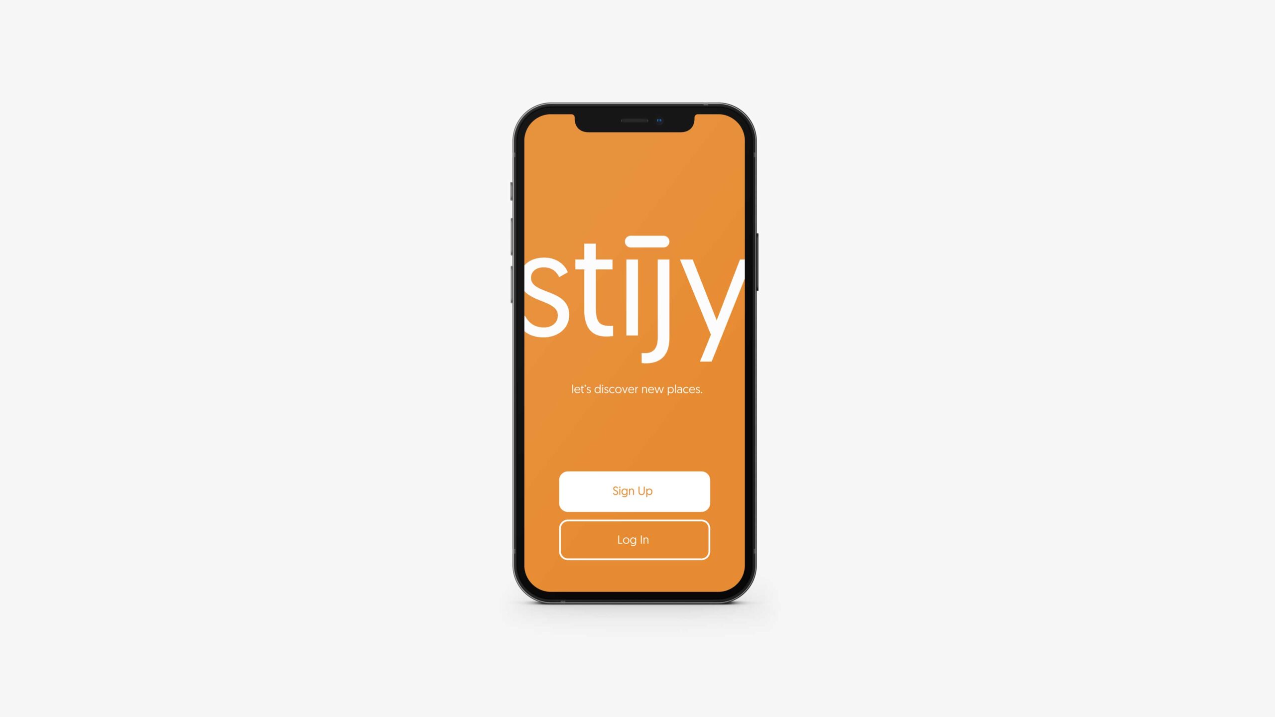
Stijy is a mobile tool designed to empower users to effectively curate travel itineraries and share them with friends.
Client
Stijy
Contribution
User Experience
User Interface Design
Branding
Year
2022
Stijy
Mobile tool designed to empower users to effectively curate travel itineraries and share them with friends.
Stijy is a mobile application aimed to help travelers easy curate well designed itineraries that will make their travel spot planning easier. Many end up using ugly spread sheets to plan their travel and we noticed a spot in the market to design a well thought out itinerary curation tool. The sharing aspect helps travelers easily find user-recommended places.
As a designer, I was tasked to develop both the brand, Stijy, and the mobile application.
This case study will display the process of two things: Stijy's brand and Stijy's mobile application UX design. Both are developed from user research to ensure intentional design principles.
Stijy's Brand
Implementing a well thought out branding initiative that brings excitement into the message and intentional design cues.
Stijy's UX
Creating an easy to use, yet aestethic travel itinerary tool which is a leagues above a typical list in a word document.
User Research
How do people approach travel planning?
After getting familiar with the problem, I set out to find out how real people around me approached travel and planning the spots they intend to go to. I conducted 15 user interviews, asking students around campus these questions:
Sample Questions:
- How do you plan out your travel schedule?
- What platforms do you use to organize your travel planning?
- What do you consider most in looking for places to travel to?
- How do you find places to travel to?
- Are you currently looking for travel places and/or planning on traveling anytime soon?
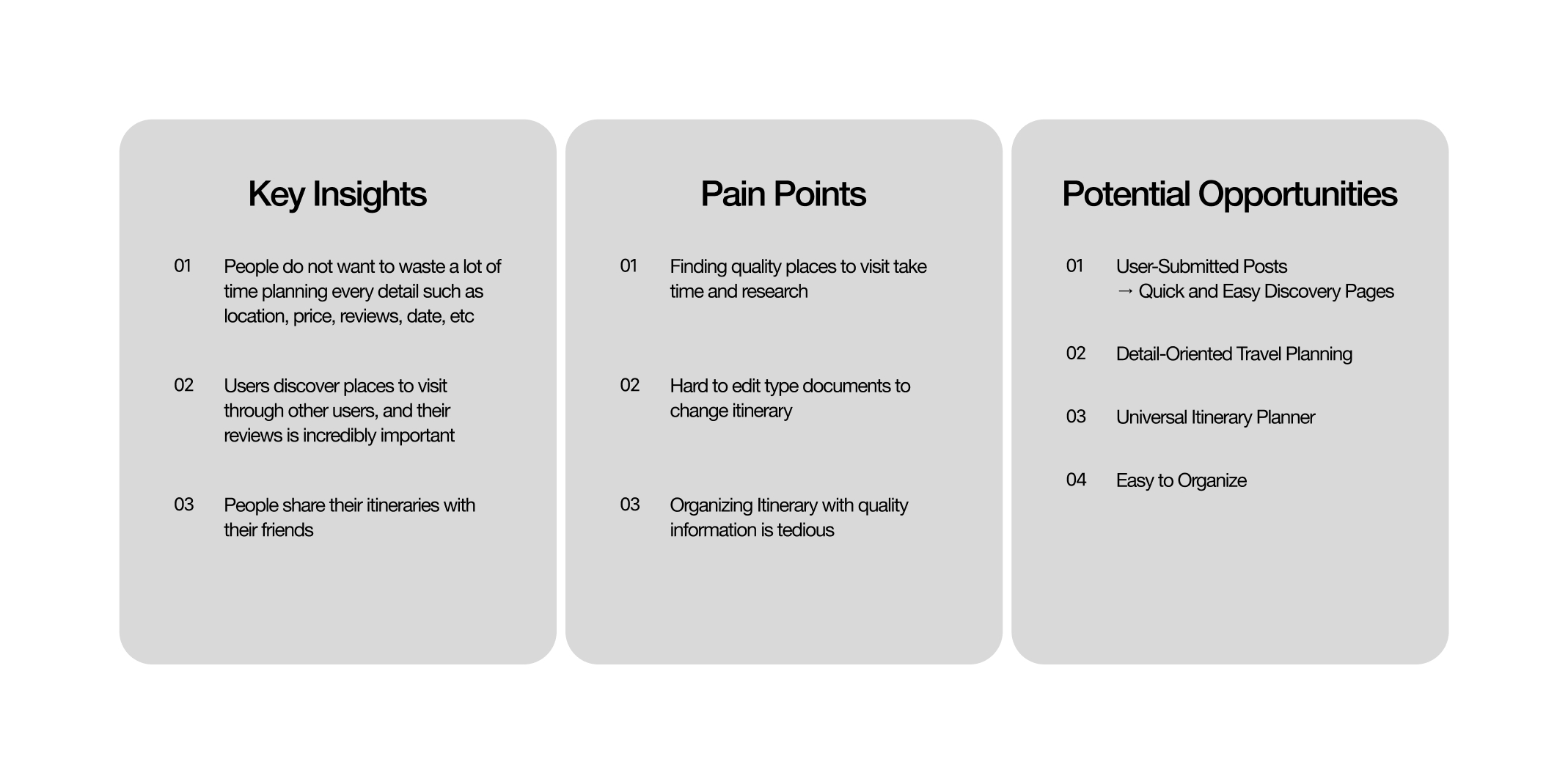
Following this procedure, I found there are two primary activities that users employ when planning their travels: Discover and Listing.
Discover Component
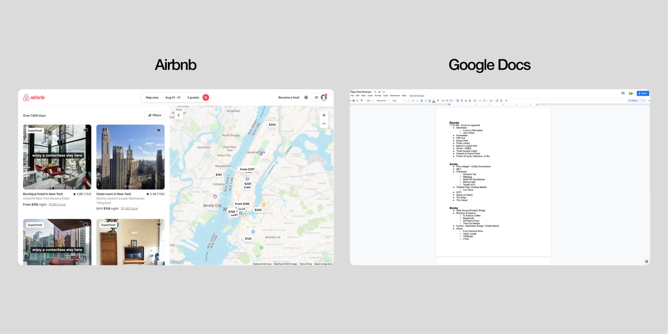
I found that most find users places to travel to by looking up videos on Youtube and browsing blog pages on the internet through search. Not a direct spot discovery tool, but most users said they used Airbnb to find places to stay, but not as a travel disocvery tool.
Listing Component
After finding places to stay, an overwhelming majority of the people interviewed said they used google docs to write down locations to visit and then proceed to share that document to their travel group.
Competitive Analysis
What do users currently use?
A majority of the people interviewed said to have used google docs or some other document program to create lists of places to visit when traveling. As an auxiliary tool, many of the same people said they used Airbnb to quickly find places around the area for housing.
Airbnb
- Easy search and discover
- Great UI
- Able to like locations and come back to it
- Abundant information available at a glance
Google Docs
- Easily Customizable
- Not Organized, Hard to digest information
- Shareable to other Google accounts
- No crucial information unless manually added
User Personas
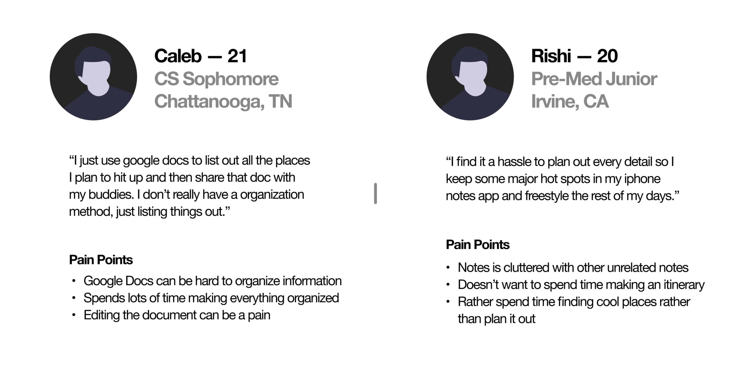
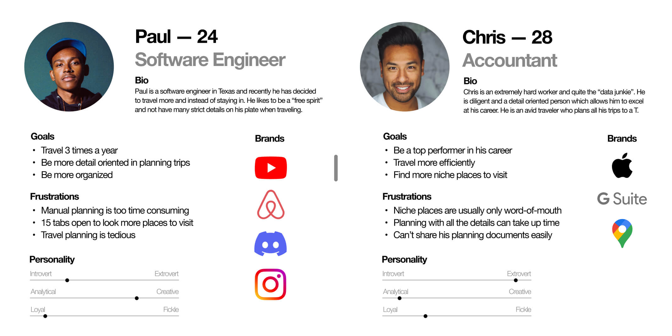
I created two user personas that represent potential users to guide the ideation process. One user, Chris, is a big planner and likes lots of information. Another user, Paul, is more free flowing and likes to discover new places.
Ideation Process
Creating a steamlined experience
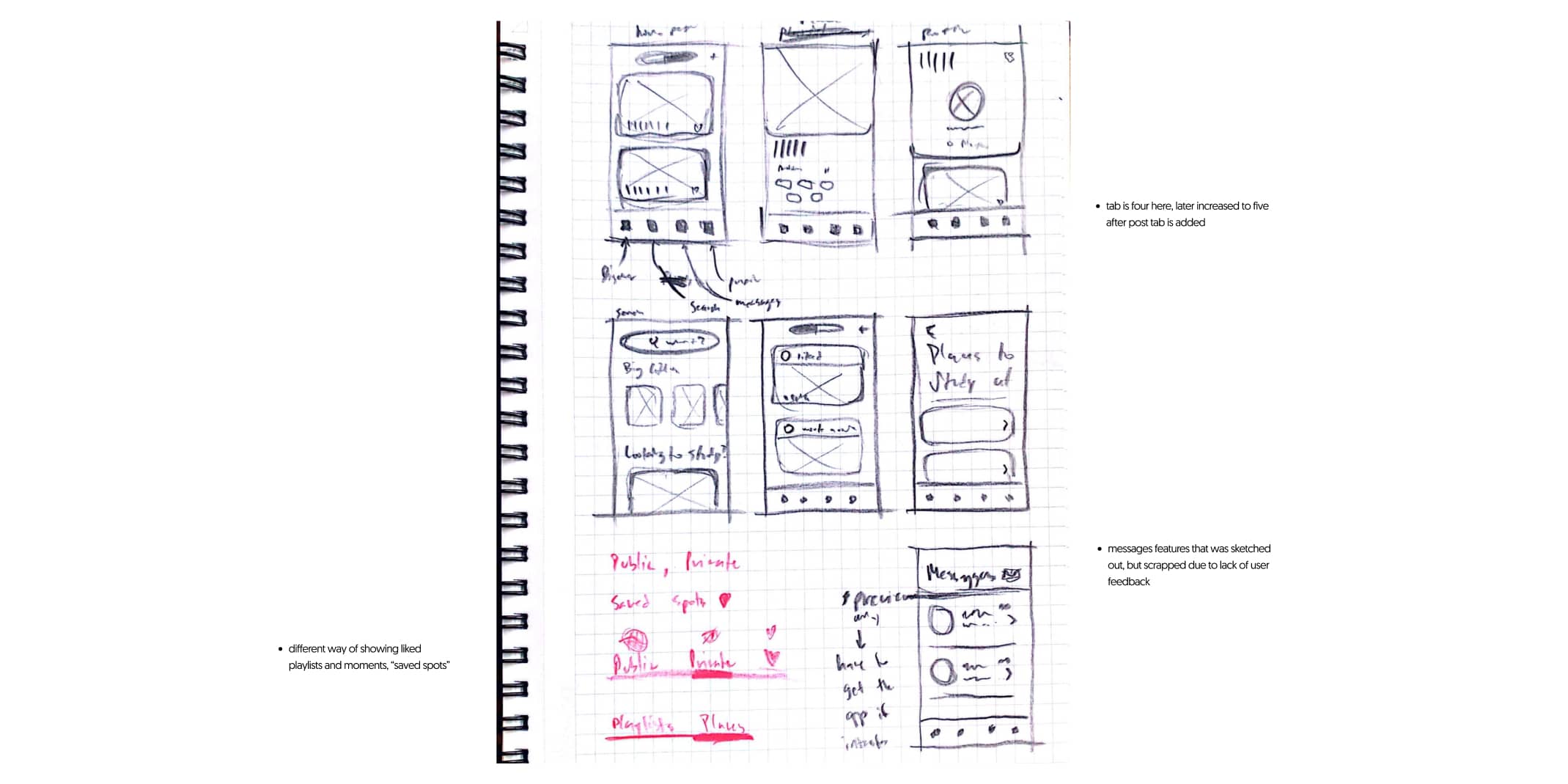
I start with rough sketches to get an idea of the application design after developing a site map.
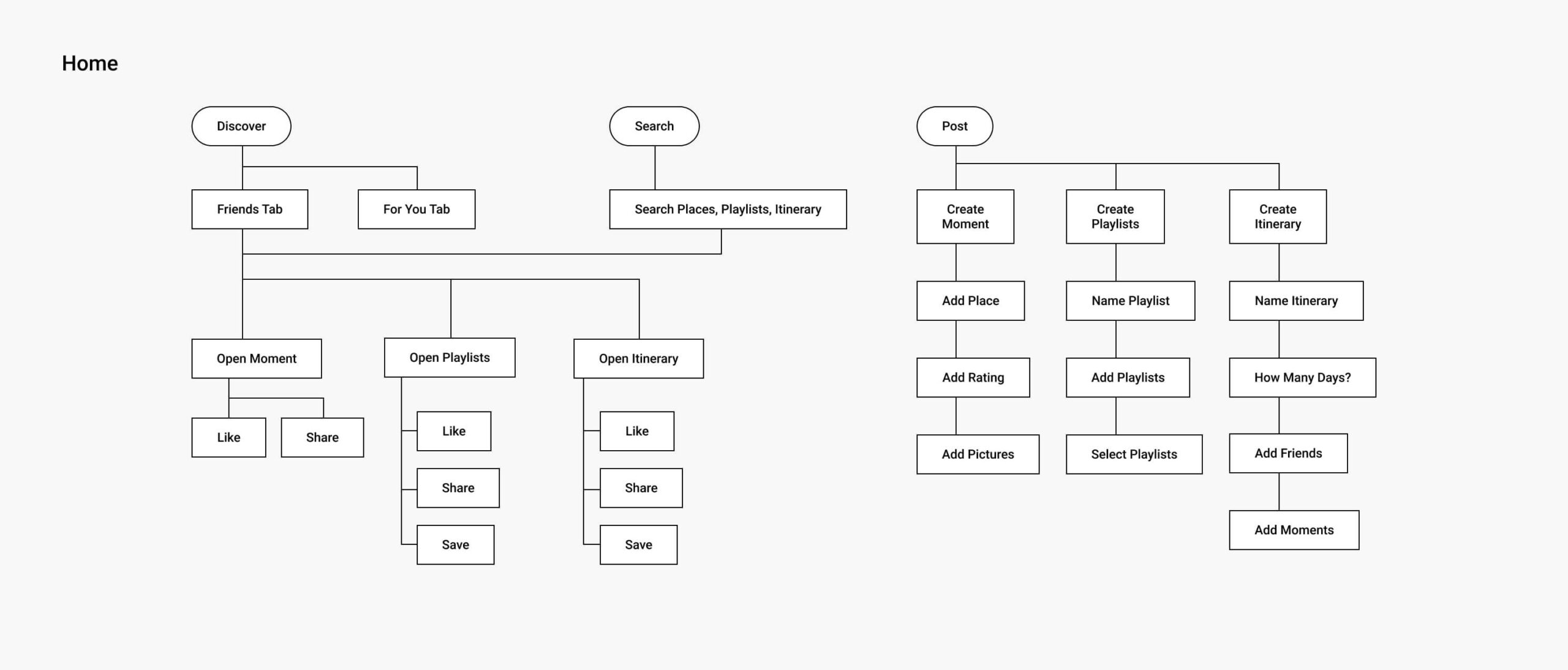
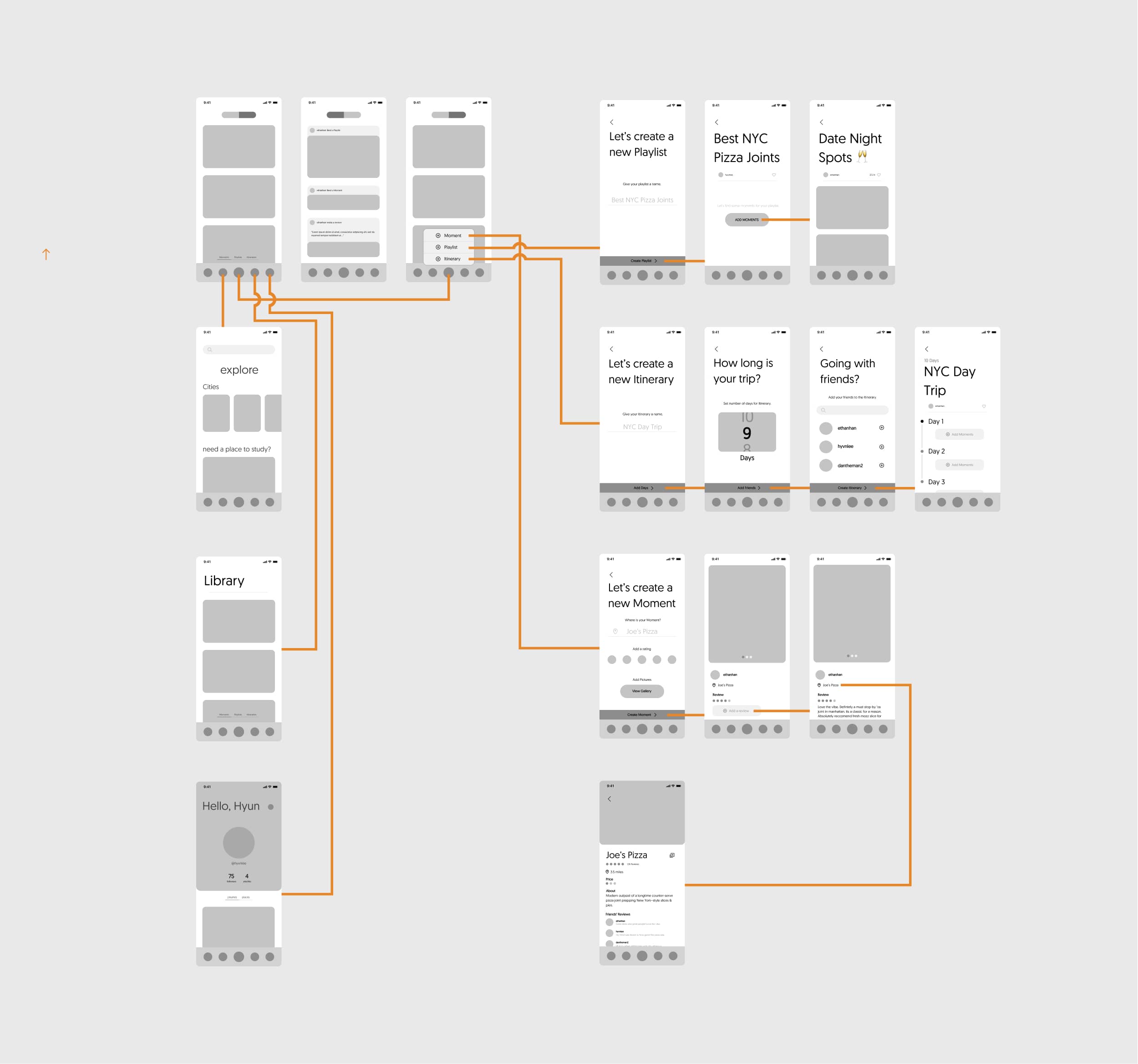
IA Diagram
After examining the user research and analyzing the business goals, an information architecture was roughly laid out. This site-map was referenced as a structure when buidling out the low fidelity prototypes. The skeleton helped with tracking the behaviors and the components needed to be added within the mobile application.
Our Solution
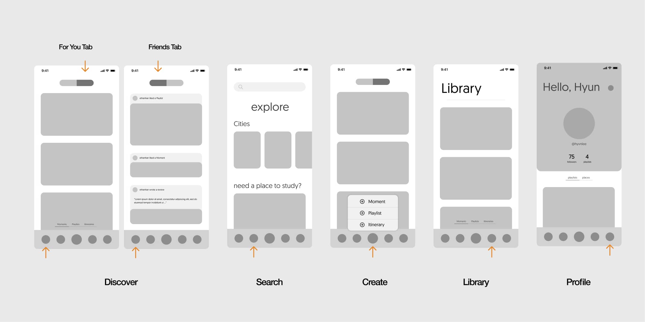
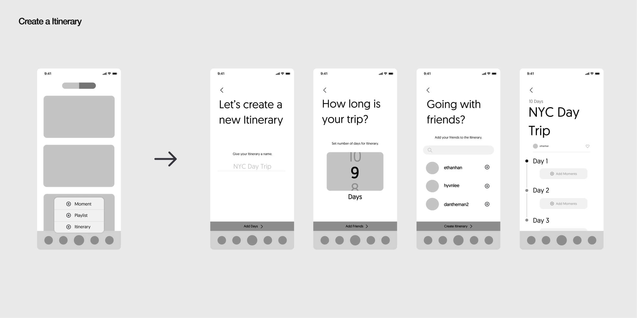
Stijy as a mobile platform sought out to solve the two main pain points derived from our user research: Easy Discovery and Easy Planning. We implemented both a social platform to allow user recommendations for local places to be viewed and shared by anyone, while also developing an itinerary curation tool that holds information such as locations, hours, prices, reviews, and day schedules.
3 Key Components make up the mobile platform:
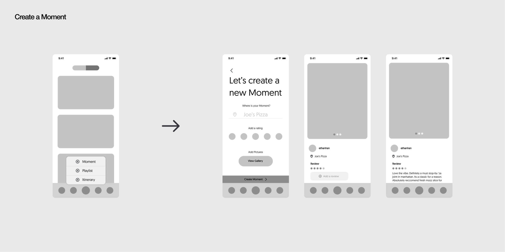
Moments
Moments are synonomous to snapshots/posts of a location that a user visits and wants to share. Each moments holds information such as the place/location, picture, rating, and review/description.
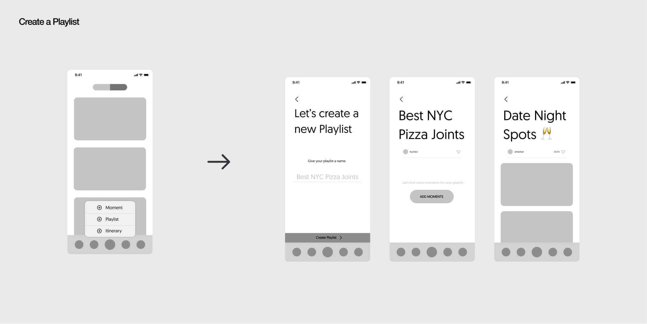
Playlists
Playlists are a collection of these moments. These collections of playlists can have themes such as "Best Pizza Places in Town" or "Date Night Spots" which have the local favorites listed within them.
Itineraries
This is Stijy's curation tool for travel planning. Stijy's itineraries can be built with moments or simple places (i.e. restuarant page) and are structured to have a schedule for each travel day. These itineraries hold all the information that moments carry.
Branding
'De Stijl'
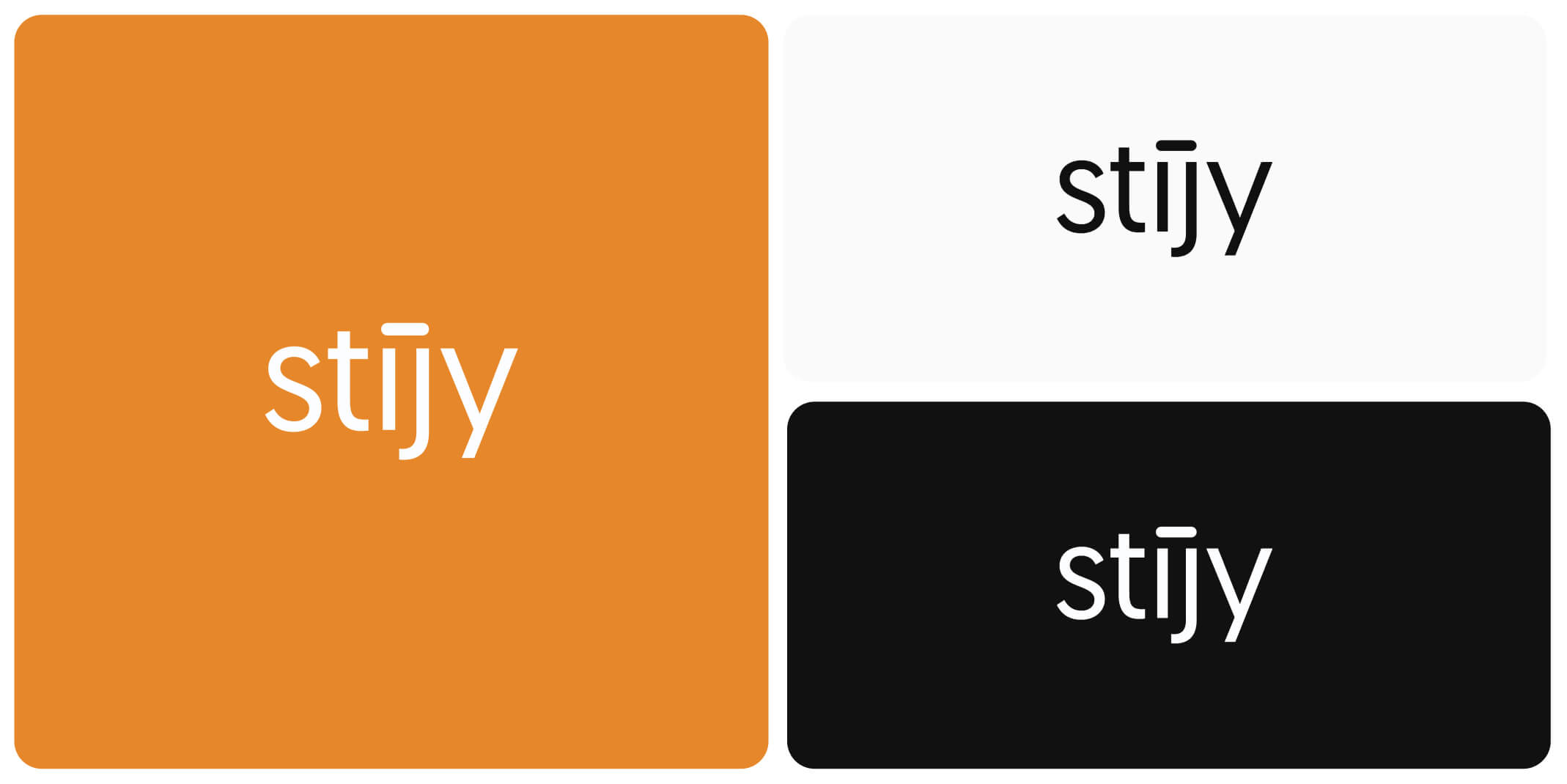
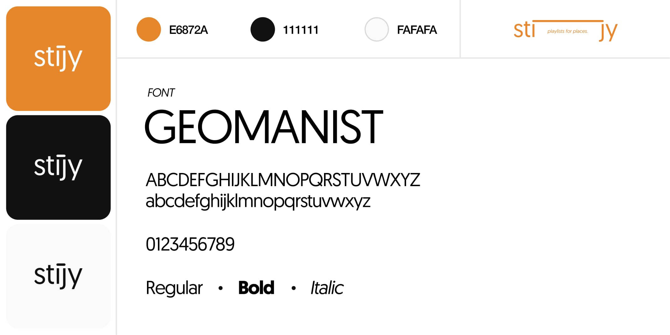
Stijy is derived from 'De Stijl', a Dutch artisitic movement, or neoplasticism, that represents line and color in its abstract form to convey universal truths.
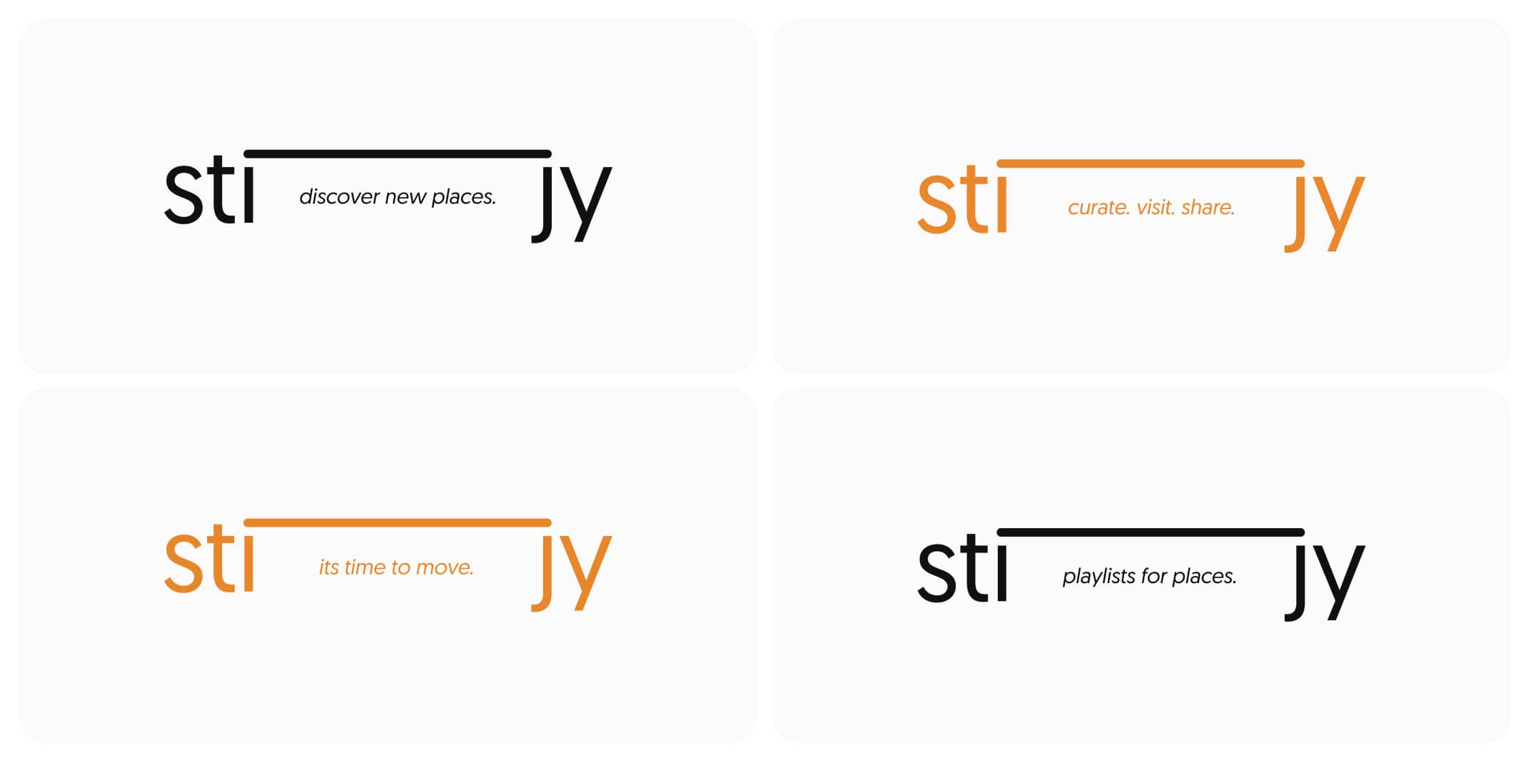
We wanted to display a sense of movement forward. Stijy as a brand represents pushing the user into traveling with utmost efficiency and effectiveness.
The 'i' and 'j' in Stijy are connected to unconciously showcase the connection between two places as a travel aid. A play on this motif is displayed where the logo is stretched.
Reflection
The next steps for this project is to develop the high-fidelity wireframes and the mobile development, as well as user testing. I loved doing both the UX and the branding on a project that fills a real world need and I'm incredibly excited for the next steps of this project.
01
Believe in the product. There is no point in designing for an end user if you don't believe in the product you are buiding. This project really opened my eyes in terms of truly believing in the product and working towards that belief.
02
Feedback is critical. When working on products that fill a certain market problem, feedback is critical in knowing what the end user wants/will use. made sure to execute and garner feedback for the wireframe and feature ideas, but in the future, more feedback is required here.
03
User Testing. The next steps would be to user test after deployment and see what features are critical and what features can be improved upon.
