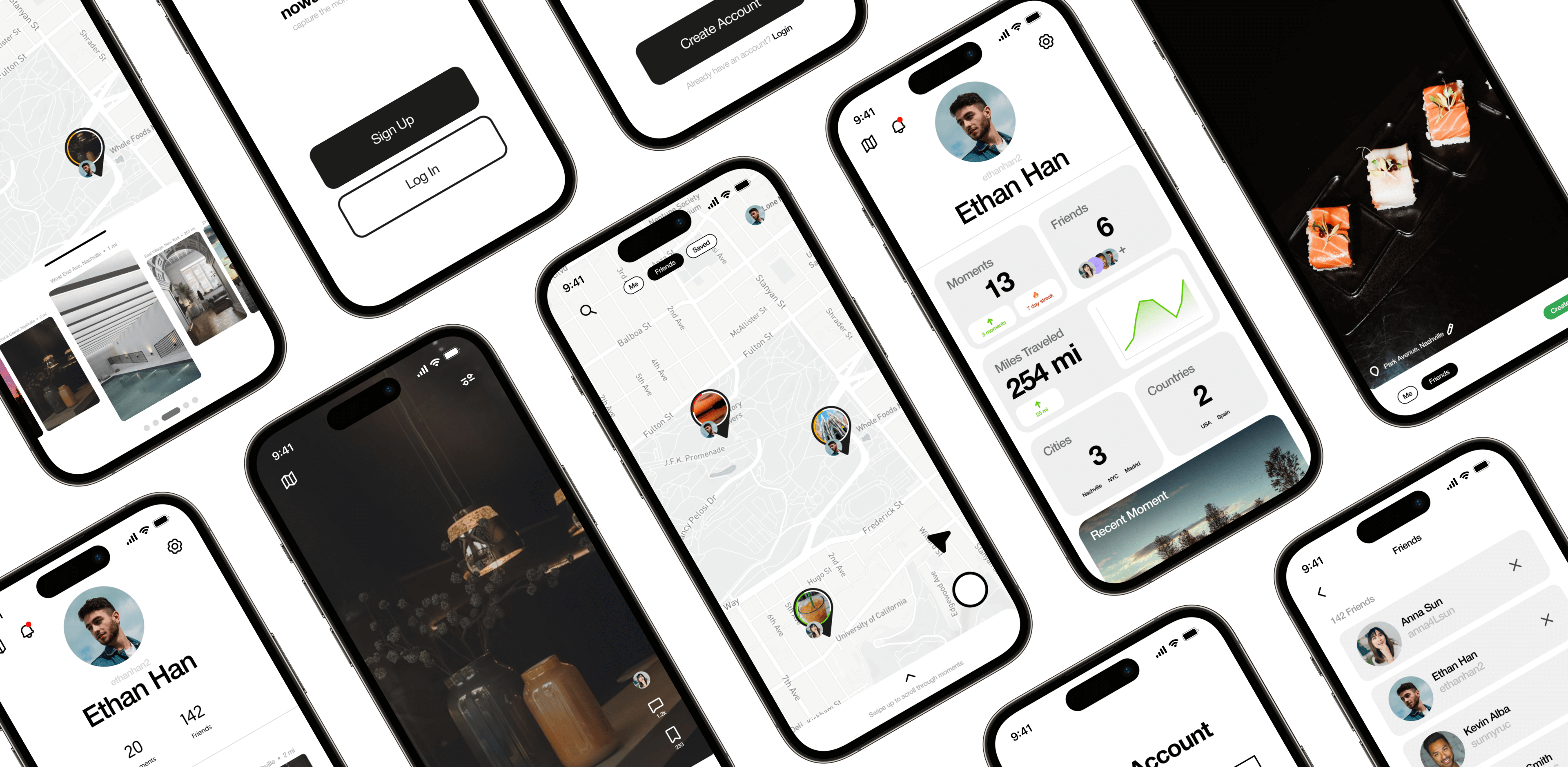
Nowadays is a social platform designed to track and share unique waypoints of one's travel journey.
This case study delves into a Product Design Audit for mobile social media apps.
Client
Me (Co-founder) + 2 others
Contribution
User Experience
User Interface Design
Year
2022—2023

Nowadays
How can we create a platform where one can visually journal their favorite travel spots and share them?
This was a redesign/pivot from Stijy, a previous project, and thus we required a rethinking of our design process to accomplish this. This new pivot contained a heavy focus on the social aspect of traveling vs the curation of travel itineraries. I explored existing social media platforms and sought to see what could work for Nowadays.
This case study will display explorations on different UI designs and the final UI concept. I tested what works and what doesn't in this process with concrete notes.
Ultimately the goal was to delve deeper into existing products out there and see what we can utlilize to maximize our designs for our products. The end UI product is based off my analysis of these products.
What Didn't Work
I've broken down and explored Pinterest and Instagram and discovered they are not suitable UI elements for Nowadays.
What Worked
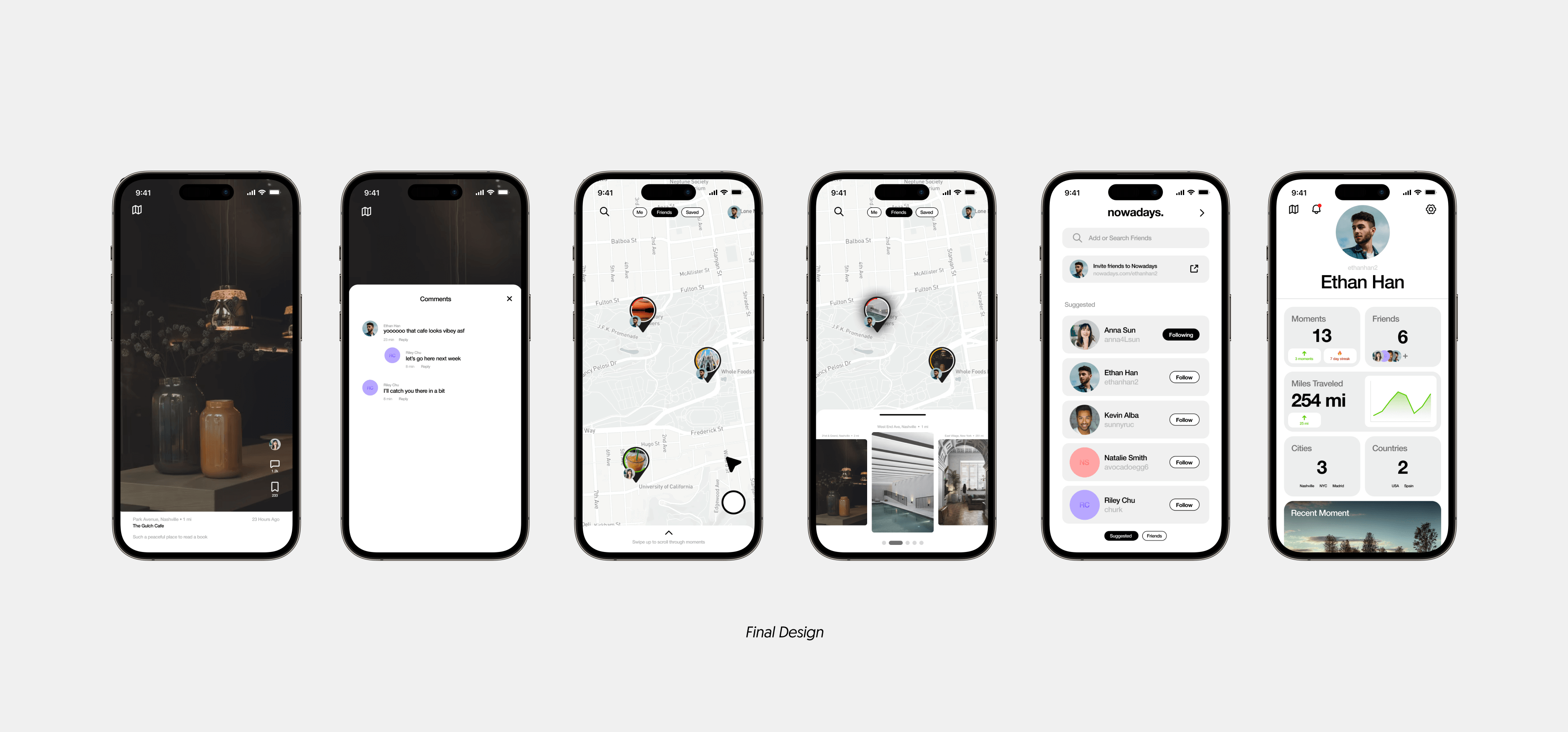
A study on Tiktok and its user experience has proven fit the needs of Nowadays. With a twist on "Map UI", it is shown how this UI study is used in the final design.
What Didn't Work
Study on the most popular static visual social media platforms
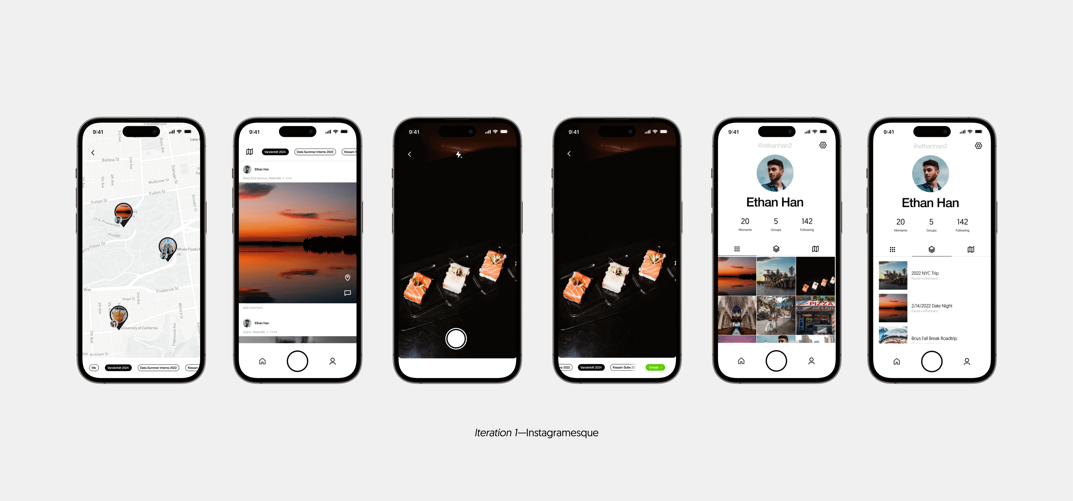
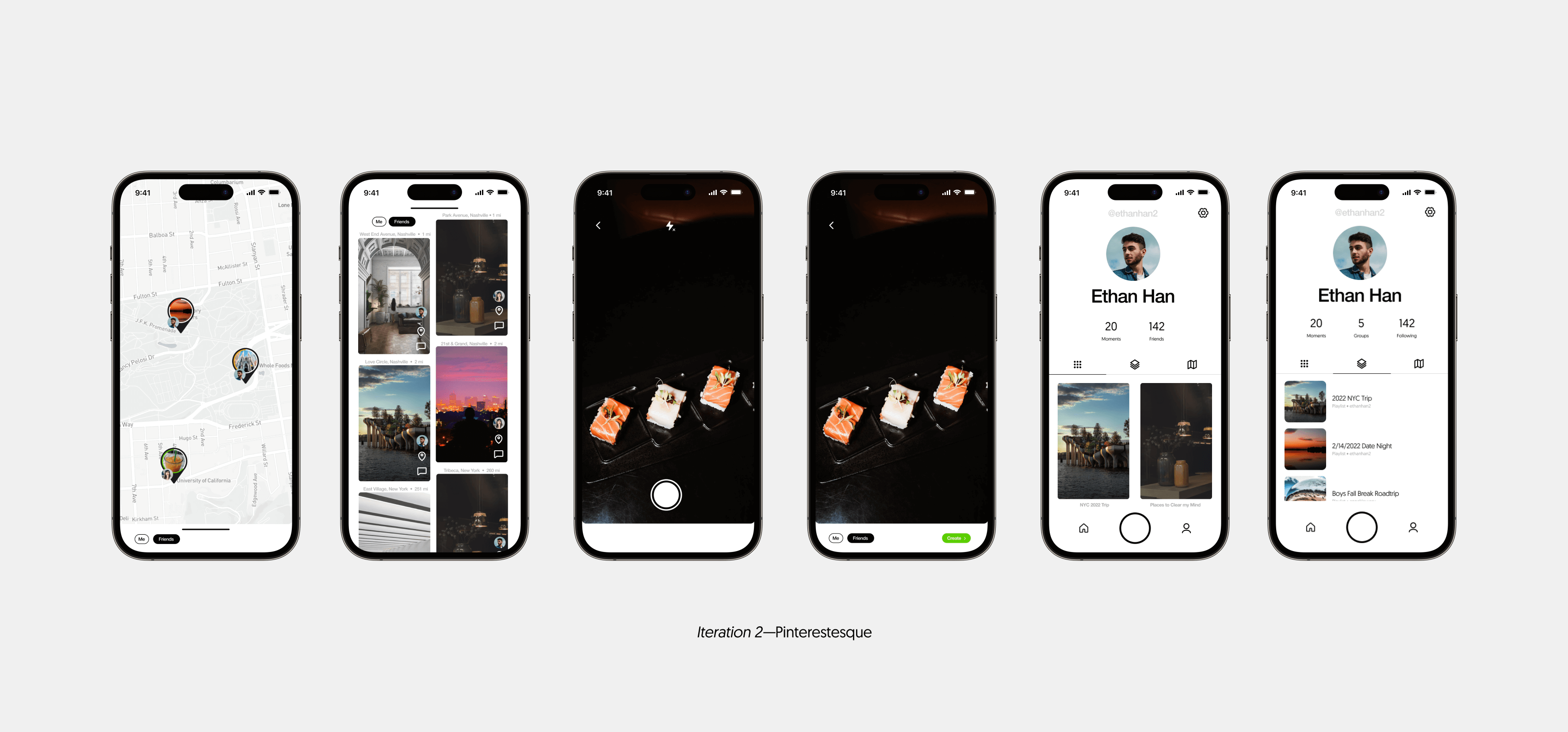
Instagram seems to be the most-used social media that is purely based on the visual-based (over something like Twitter which is text-based). Pinterest is also a visual social media that is extremely popular that is mainly used to curate groups of images for mood boards. Nowadays is mainly a visual travel journal, so I designed a rough prototype on the style of Instagram and Pinterest and tested it among our MVP critieria.
The main exploration UI was set with a unique "Map UI" as shown on the left, but exploration on how to display each location was needed.
Study on Instagram
- Minimal colors
- Aligns with the Nowadays design system
- Sharp corners
- Too refined feeling. Nowadays should feel like a travel companion, something softer is needed.
- Even Ratio Images (i.e. Square-ish)
- Not the best way to display locations. Users tend to take images vertically of places (evidenced from Instagram Stories)
- Not the best way to display locations. Users tend to take images vertically of places (evidenced from Instagram Stories)
Study on Pinterest
- Too Crowded
- Pinterests strengths comes from the UI of mass images in one spot that users can browse through.
- We wanted something more intimate with the focal point on one location at a time.
- Soft corners
- This fits the Nowadays design feeling when browsing. Nowadays should feel like a travel companion, something softer is needed.
- Vertical Ratio Images (i.e. Rectangle-ish)
- This iteration fit more inline with what we were looking for. More real estate in displaying the locations visually.
Why These Didn't Work
The UI of Nowadays required a certain way of displaying each location to fit the "soft, intimate travel companion" feeling we entended. This required a large focus on each image, one at a time, while also allowing quick exploration on shared locations. Instagram allowed for good organization, but wrong image UI while Pinterest allowed for quick exploration, but lost the focused design we were going for.
What Did Work
Study on the format of Short-Form Content
Why did Tiktok rise in the ranks of social medias during our generation? The immense rise of short-form content has pushed users to gravitate towards easy-to-use, quick moving content.
The design above contains the useful parts from the Tiktok study, and also contains other UI design elements for our MVP (Map UI, Profile Travel Tracker, "My Memories" Tab, etc)
Study on Tiktok
- Fitting Ratio
- Vertical Full-Screen images is best displayed for Nowadays content
- One-at-a-time Scroll
- Tiktok grabs the user's attention fully by displaying content one-at-a-time, but provides a quick way to scroll to the next piece. Nowadays contains static images, but the principle works here as well.
- Comments/Saved
- The UI Tiktok uses for user interactions on each post is quick, easy, and intuitive.
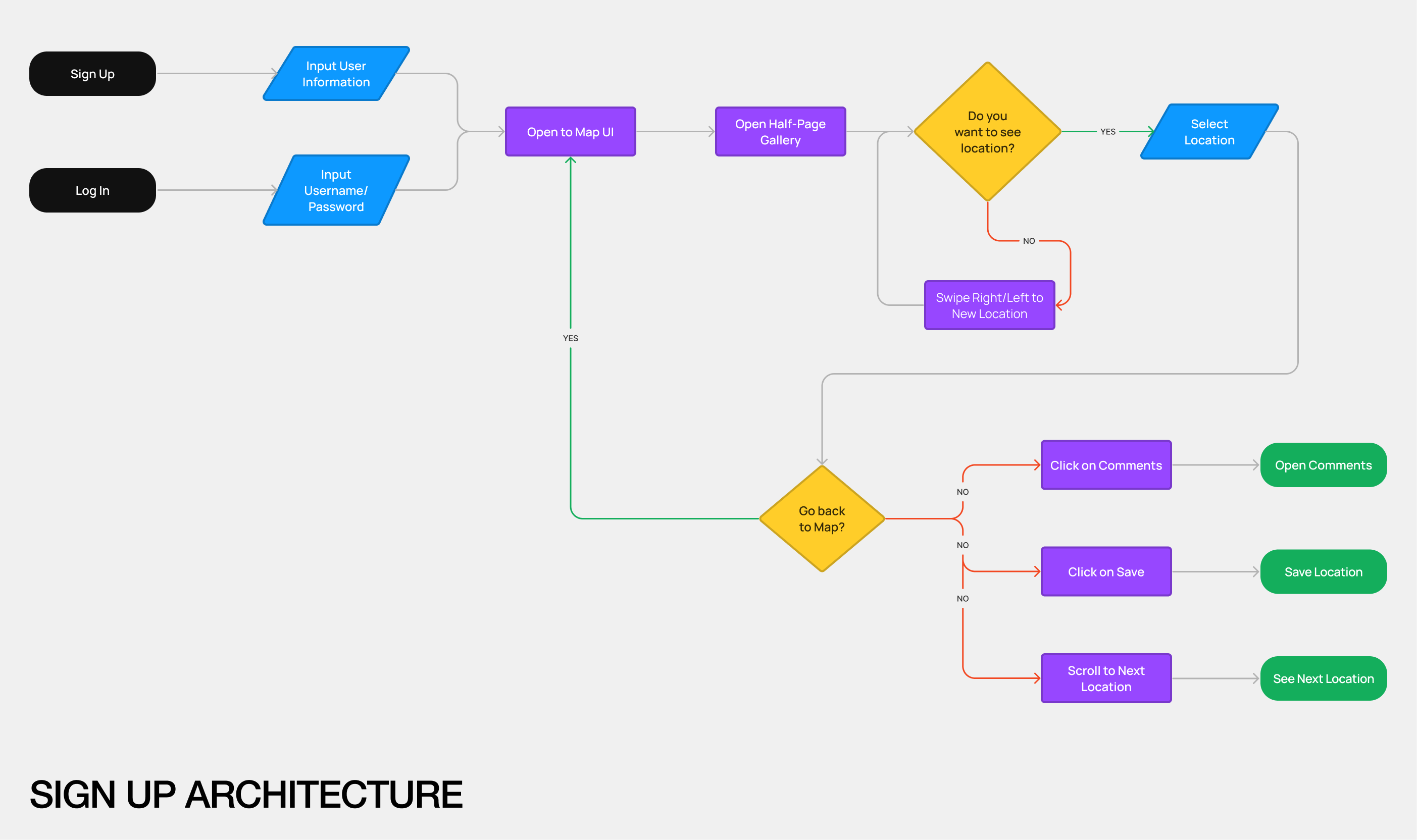
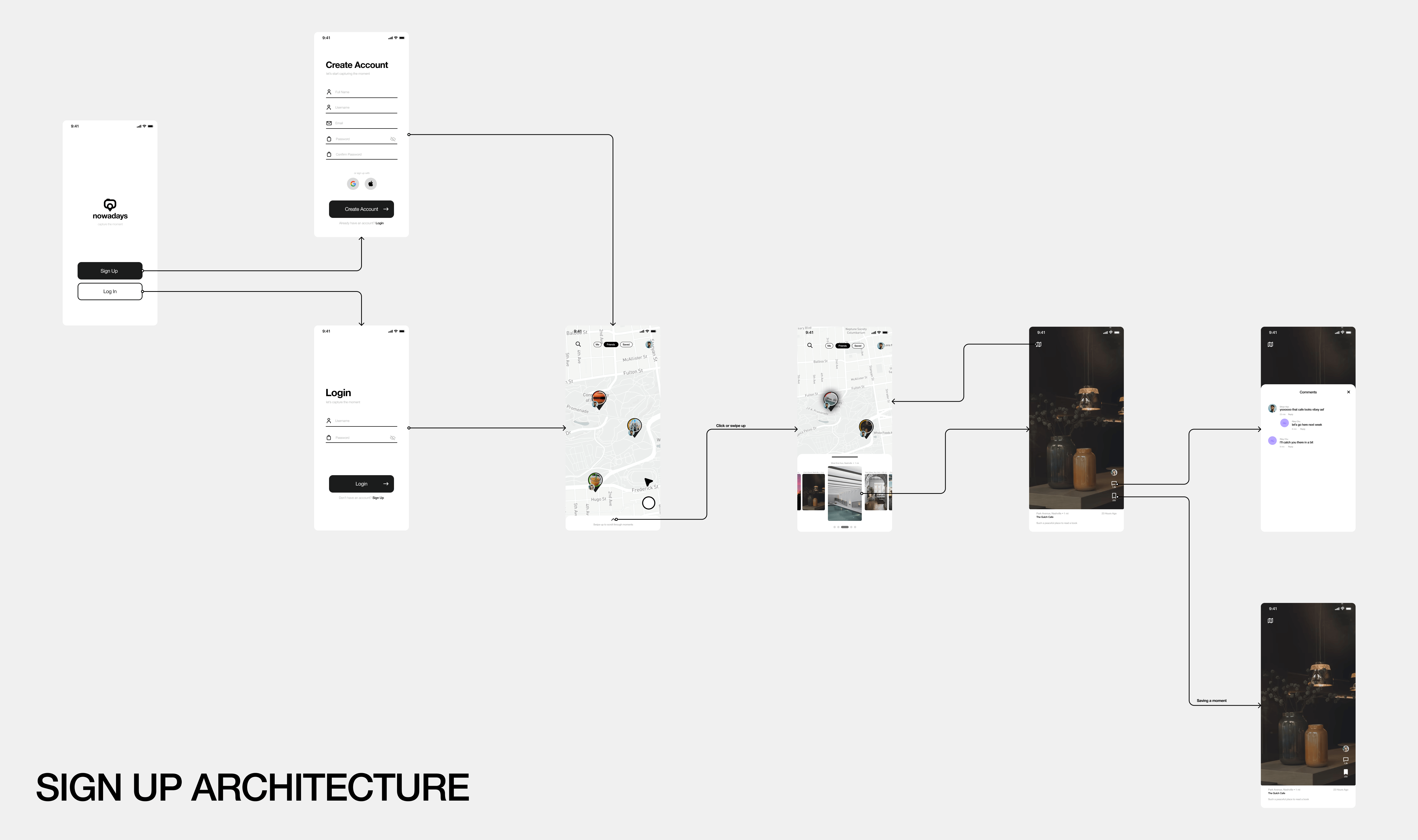
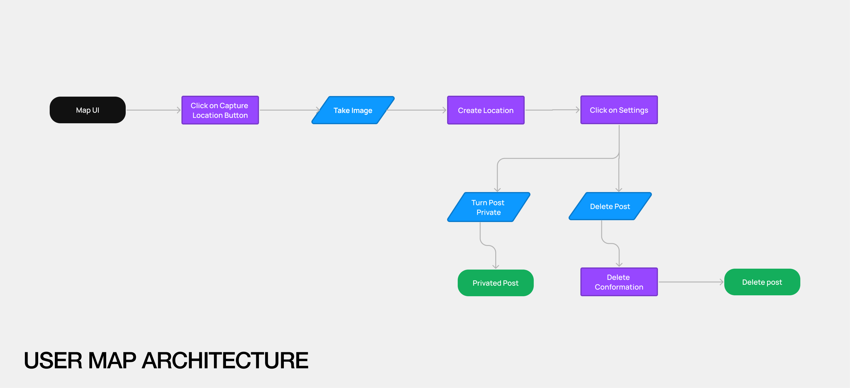
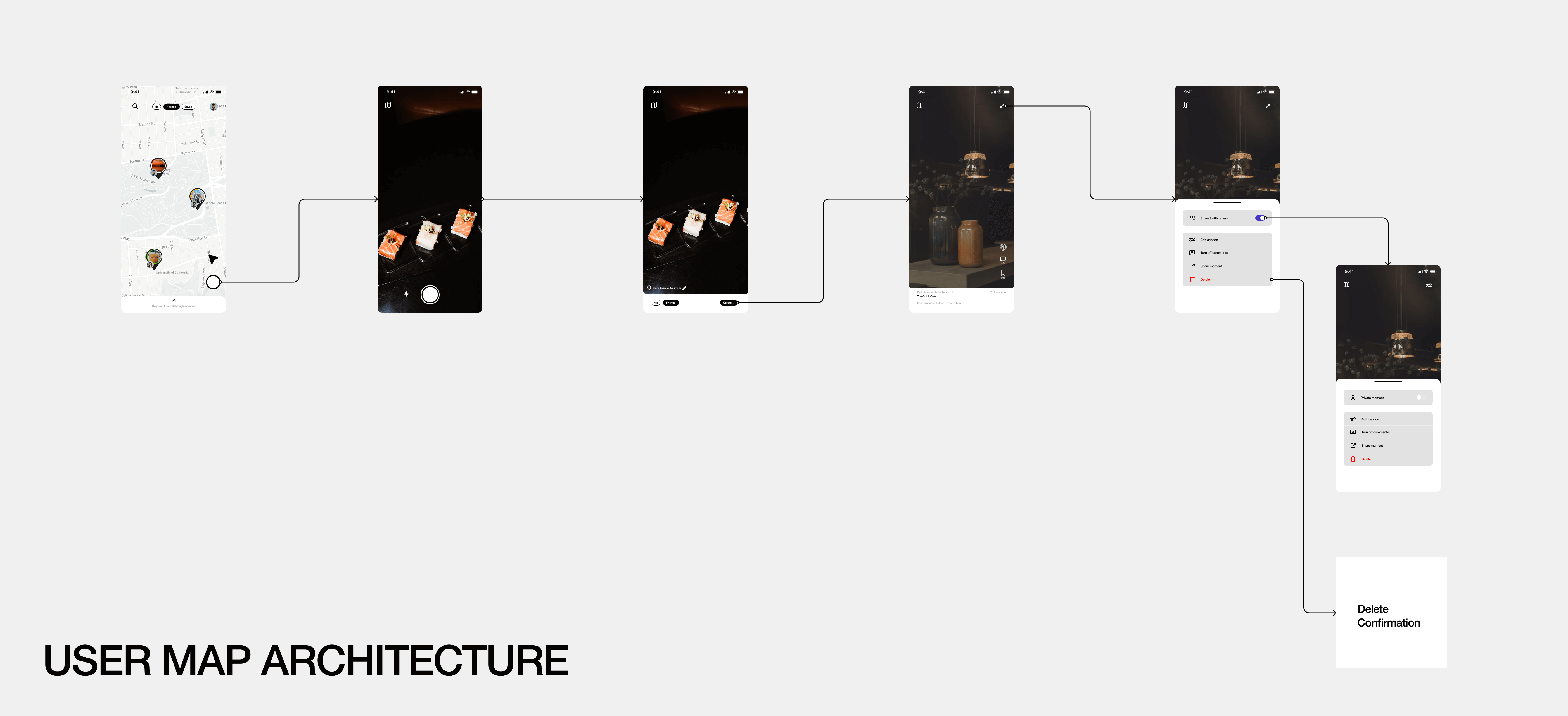
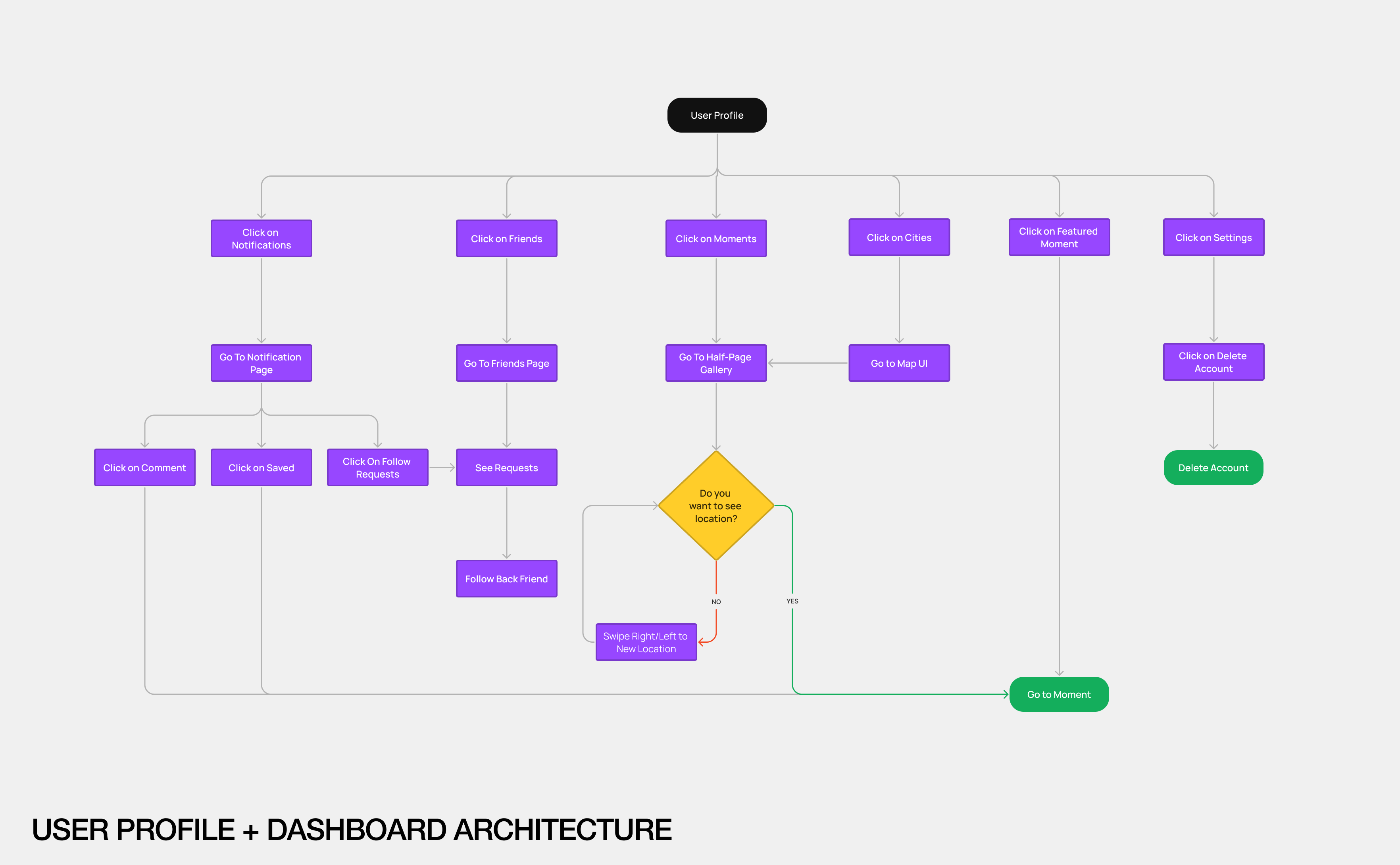
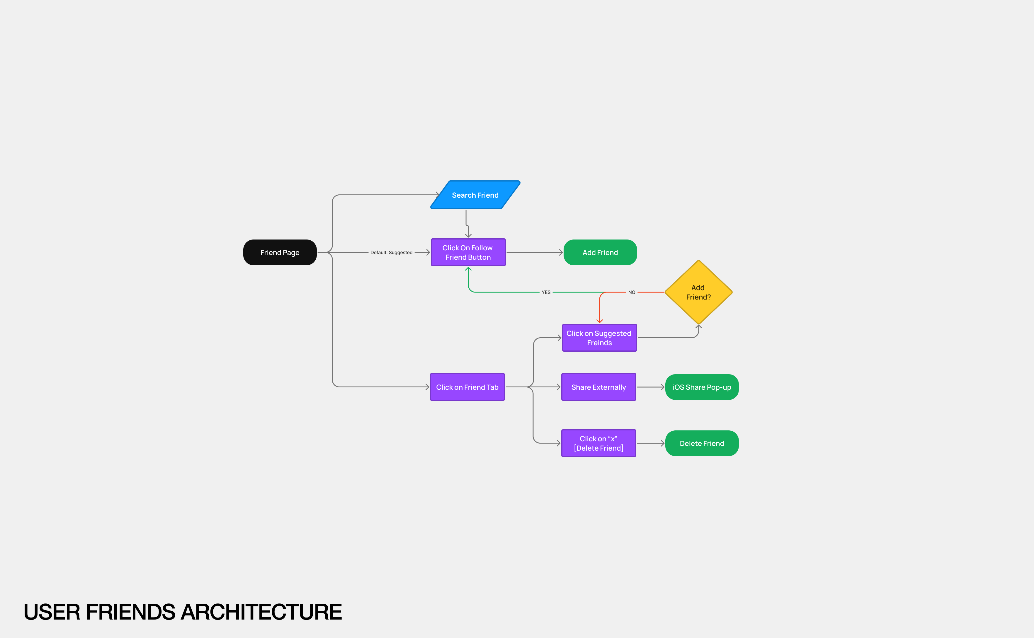
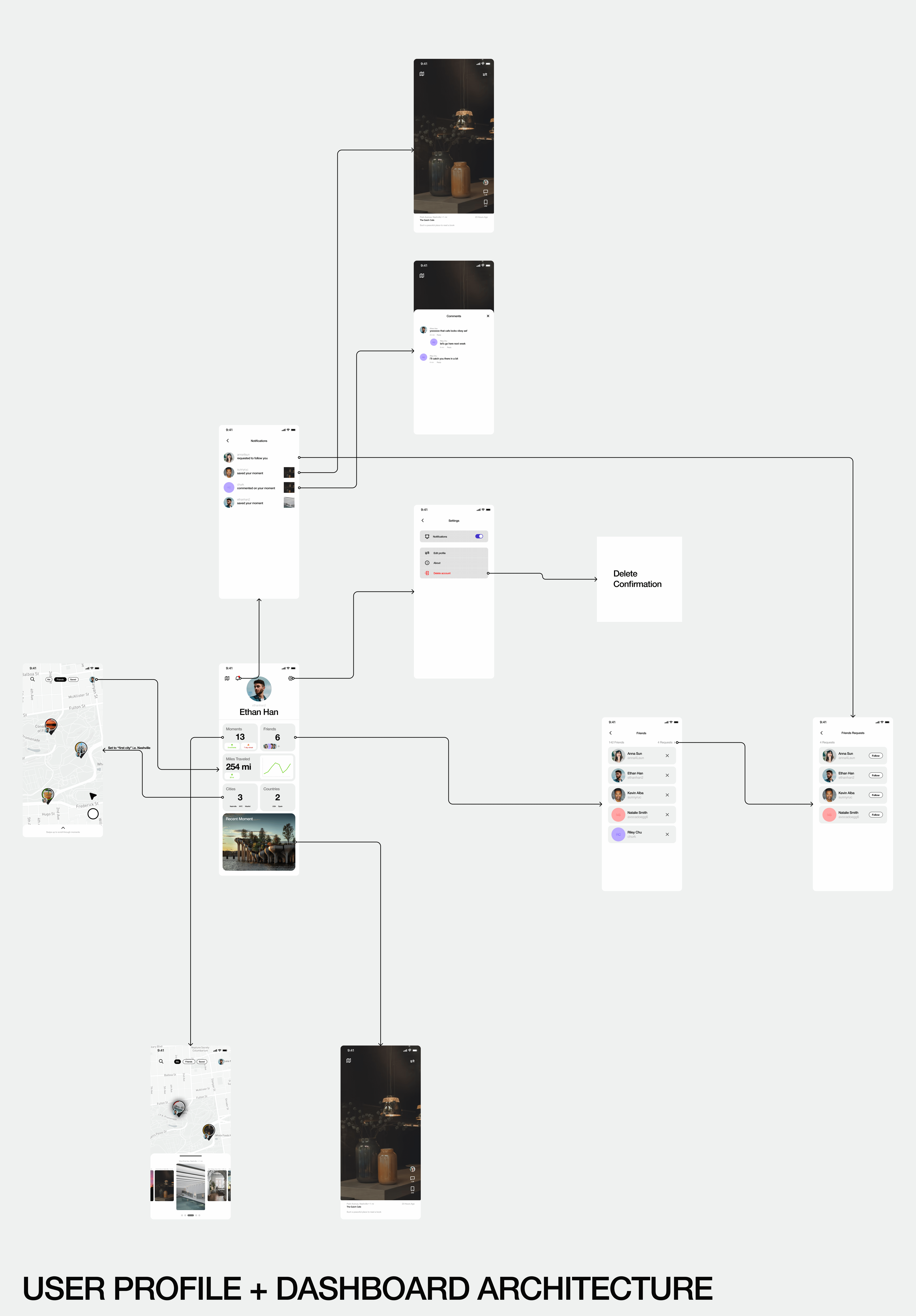
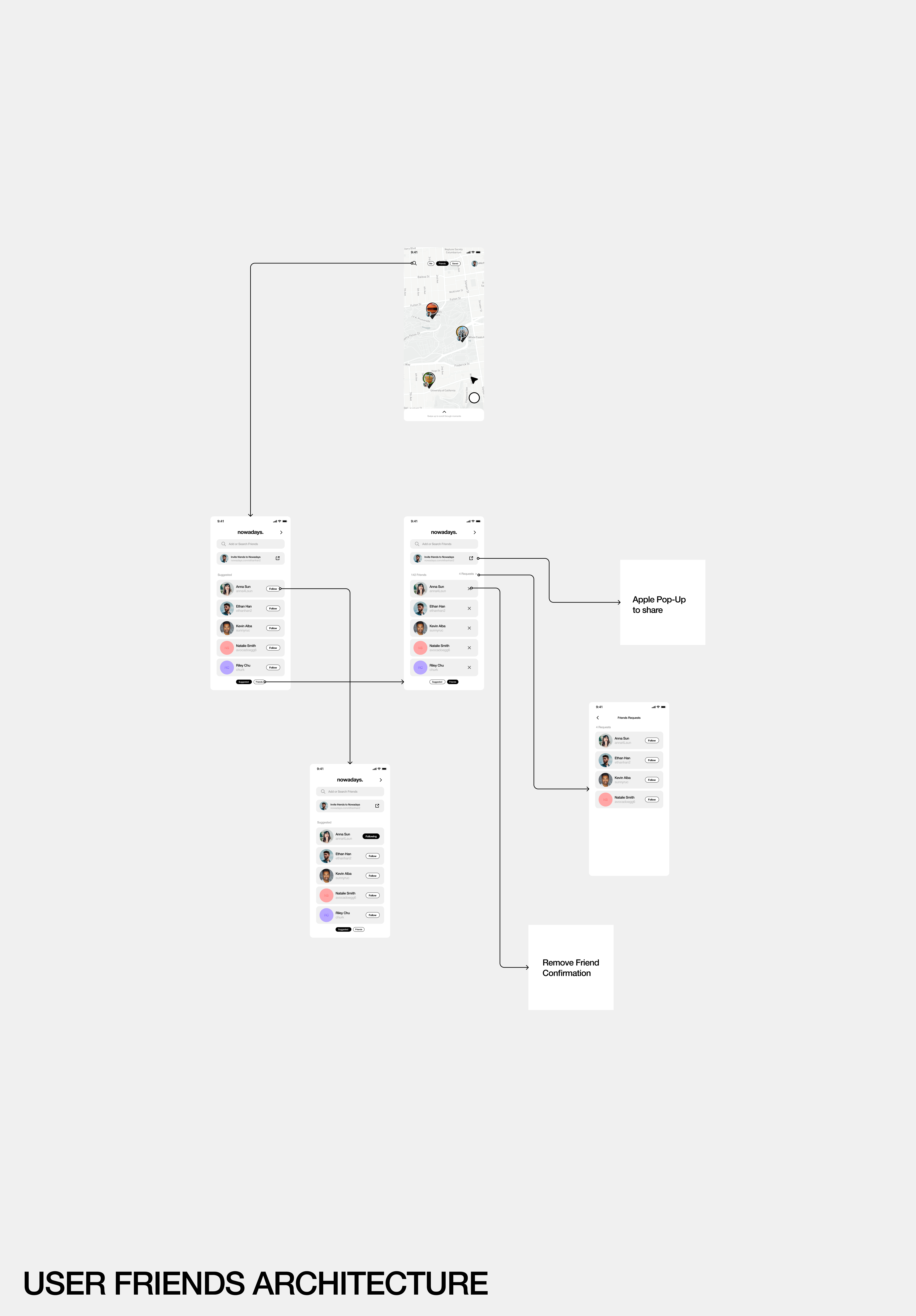
User Flows
Mapping out the UI
I started with a mapping of each user flow and represented each flow with the respective HIFI prototype screens.
Reflection
I've explored what exists out there in terms of social media platforms and have derived them into what the needs are of my product. Focusing less on UX and more on the UI, I've developed a keen sense on what it is that drives a user to be engaged and how to keep them fascinated with a platofrm.
01
Construct a firm problem. There must be a problem for there to be a solution. How do I create a captivating, yet innovative UI for travel? This question took me into this project of exploring and studying the UI of exisitng systems.
02
Clean, clean, clean. Working with several UI elements here, it is crucial to be detailed and organized in my work so I understand what parts aren't working and I can adjust on the fly without needing to search for things.
03
User Testing. The next steps are putting these design through a gauntles of qualitative and quantitative user testing to validate the designs. I hurried through to high fidelity screens due to wanting to present work to start-up accelerator programs.
