
Wave Nightlife is a mobile platform that provides a line skipping service, utilized by nightlife venues in the United States. Branding was an important aspect for the client.
Client
Wave Nightlife
Contribution
Branding
Year
2022
Wave Nightlife
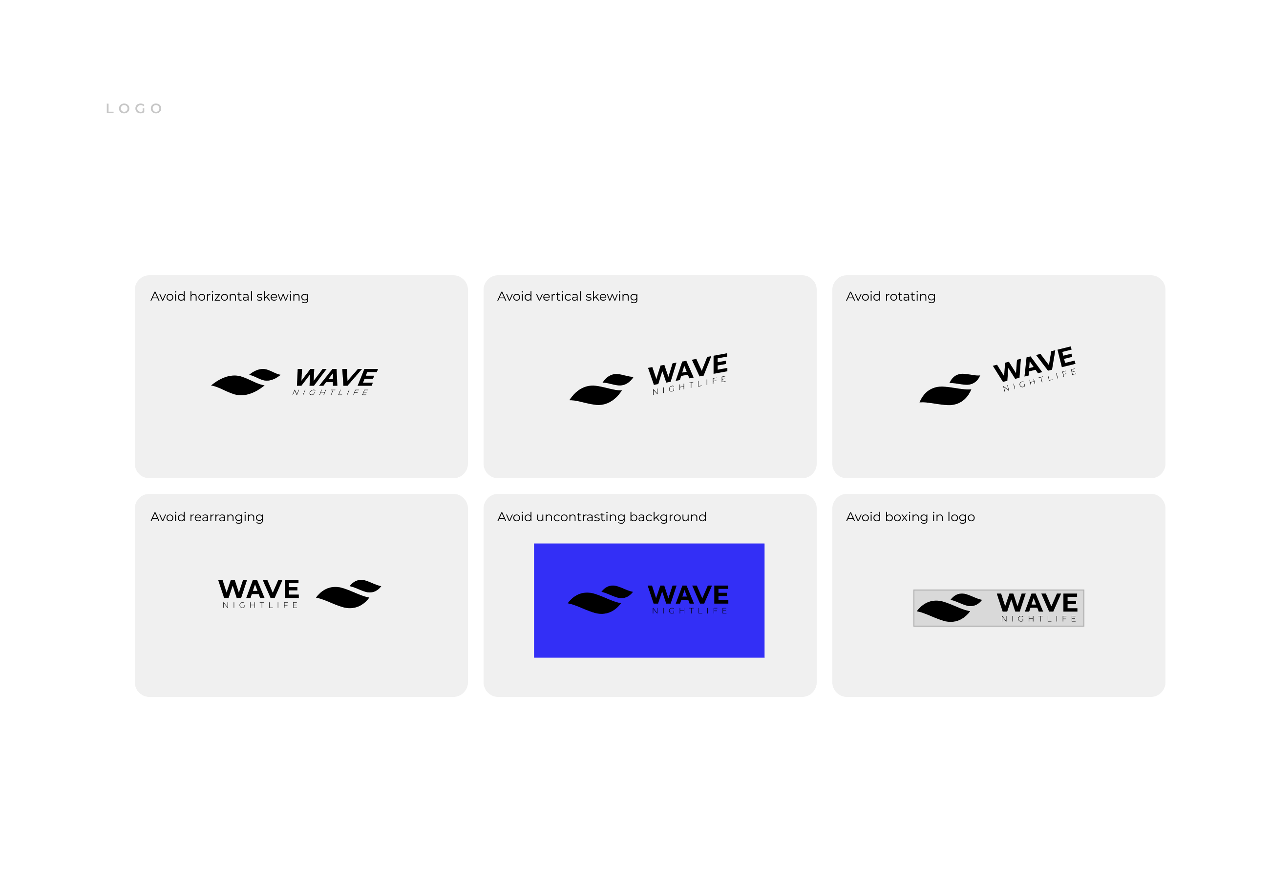
How do I create a brand that is consistent and scalable?
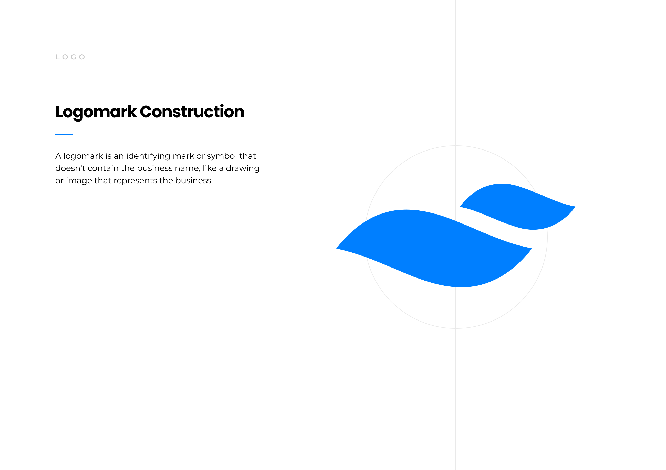
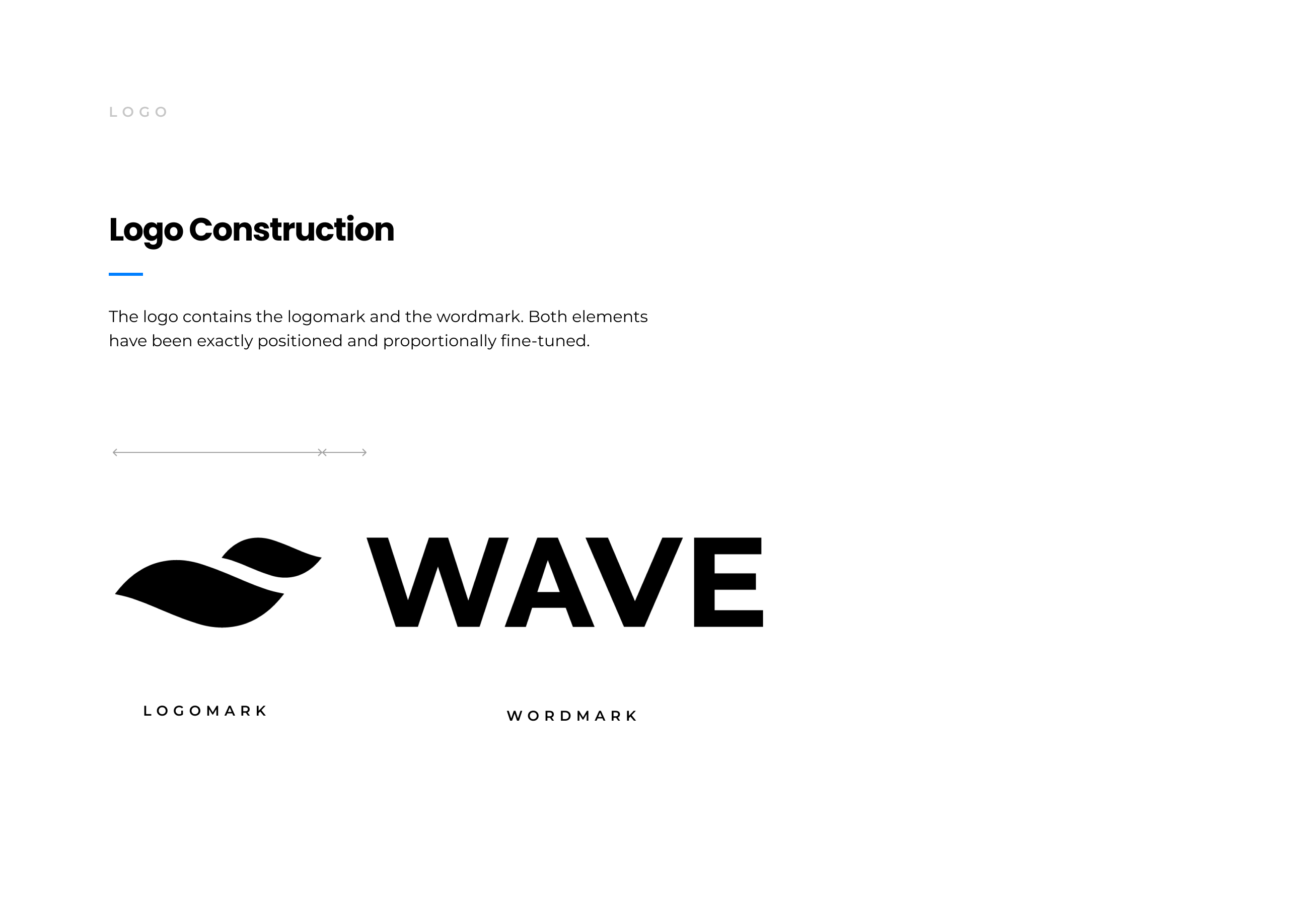
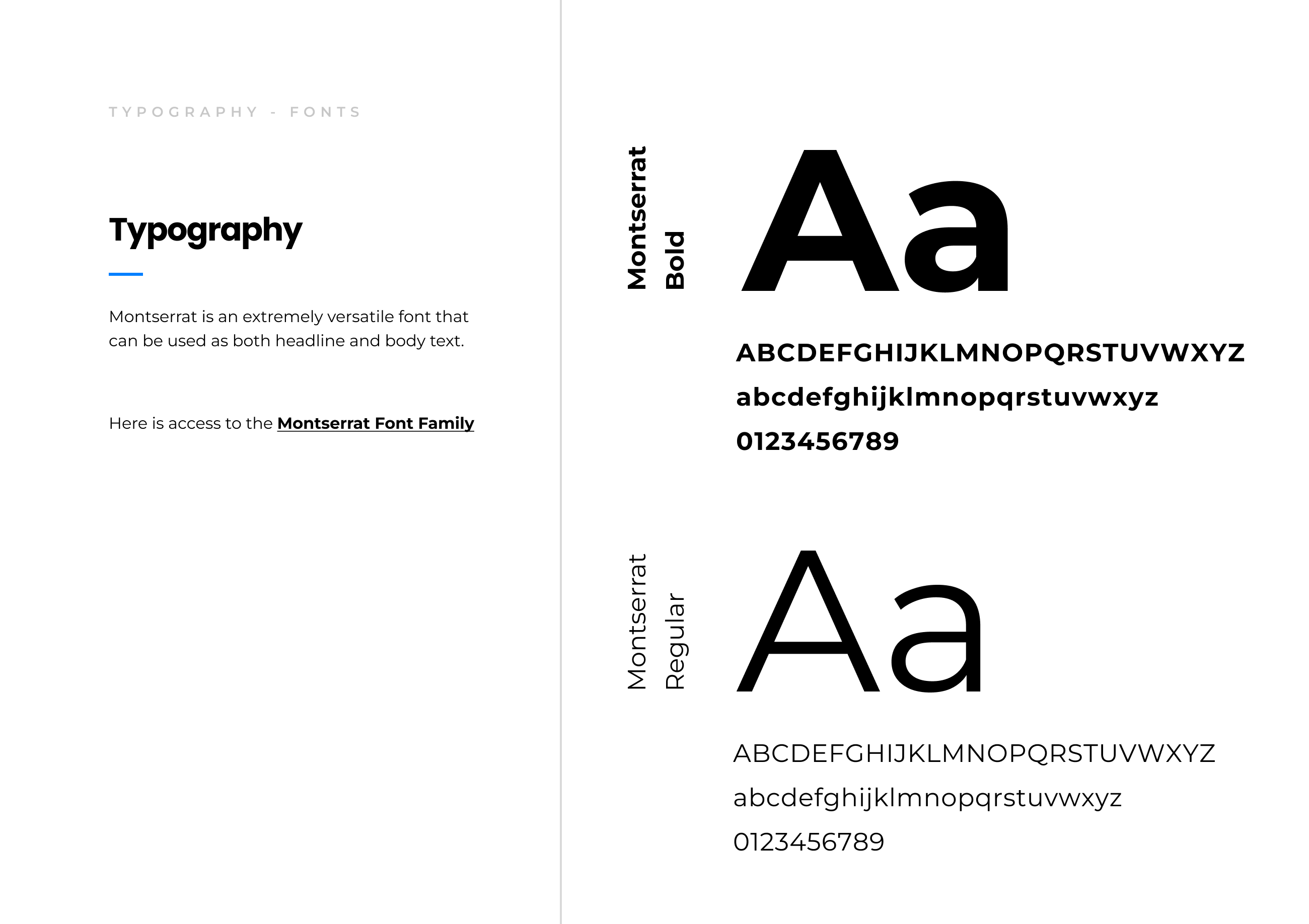
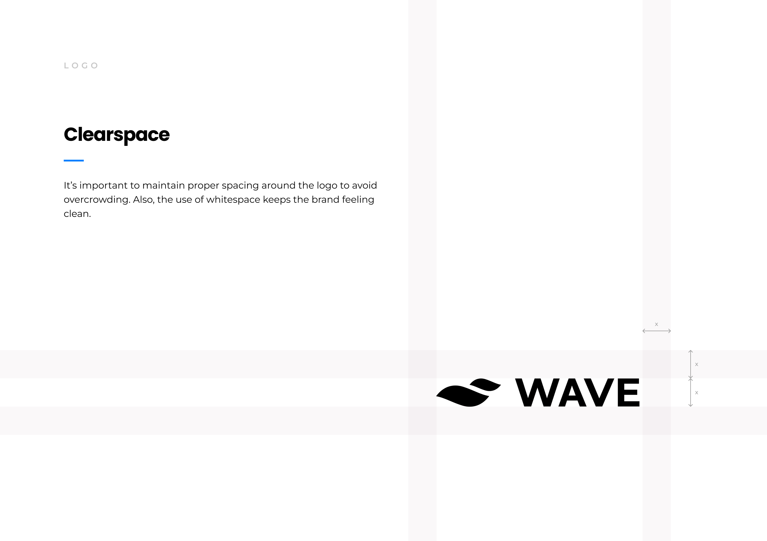
The client requested to take the startups image in a tech-oriented, clean, and scalable approach. Of course, there iterations of everything including thinking about typography, color, vibe, etc to fit their desired feel.
My Take: Branding plays a pivotal role in the success of a startup for several reasons. It helps create a distinct identity and sets the company apart from competitors in a crowded marketplace. A strong brand communicates the startup's values, mission, and unique selling points.
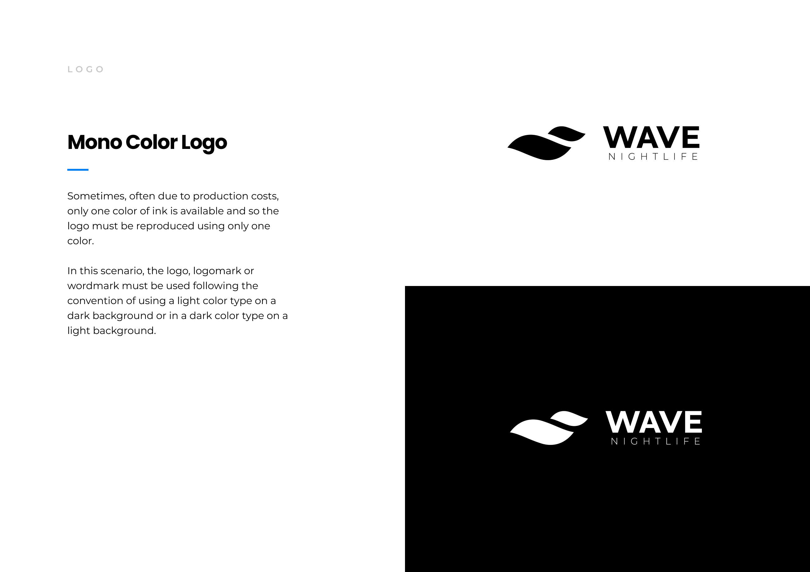
In developing the branding, I infused notions from the company name, but also the overall feeling that the client wanted to convey: a trustworthy, consistent line-skipping service that fits the modern landscape of tech.
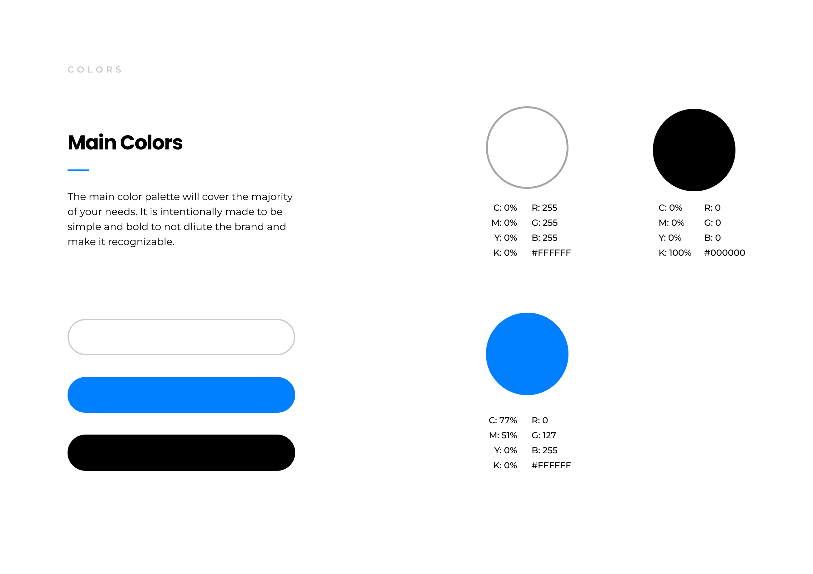
Why Blue?
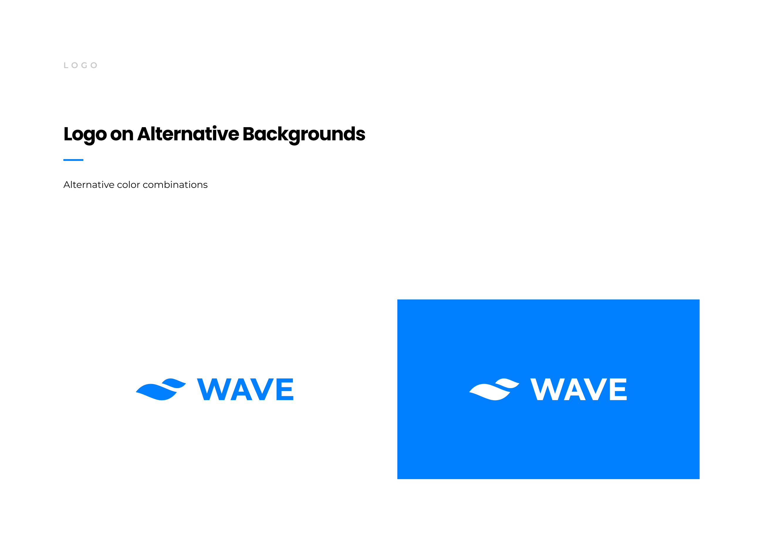
Blue is associated with qualities such as trust, reliability, and professionalism. Conveying a sense of calm and stability, allowing it to be reassuring to customers, particularly in industries like finance, healthcare, and technology. The color blue is also widely recognized and tends to have universal appeal, making it a versatile choice for a startup's branding.
Check out the Figma file I sent to the client here:
This was purely used to communciate the design. All final deliverables and formats were sent seperately.
New User Walkthrough/Tutorial
Fusing Branding into the App Experience
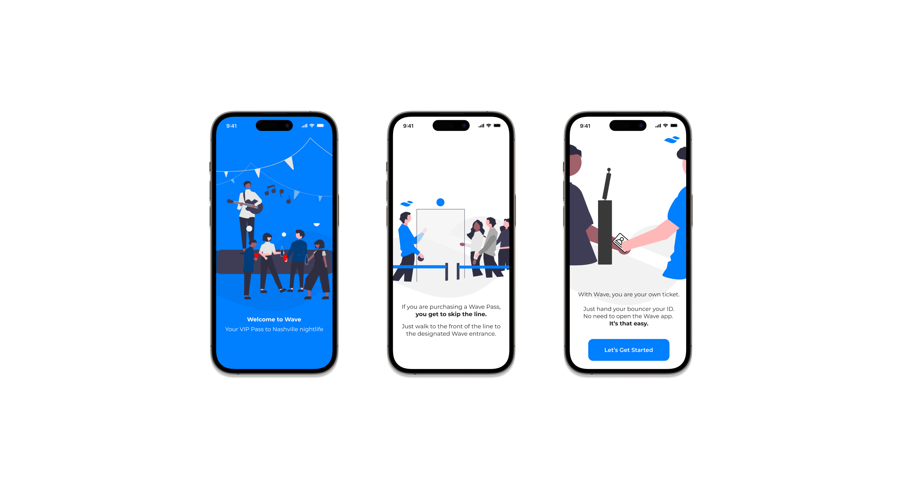
The client also asked to build a app walkthrough for new users on the app (something they had reached out months afterward for) and of course, asked this simple walkthrough to follow the branding I had completed for them previously.
I needed to graphically showacse a real life scenraio, but also keep the scalable, clean design I had built for them in the beginning. I decided to use focused color as a method to deliver important aspects of storytelling in the process of informing the user how Wave's service works.
You can see this in the final design where the branded blue is used to keep the user's perspective in mind (identifying the user). This simple approach aligns this tutorial to be clean, consistent, and scalable.
Keep it simple, stupid.
Reflection
This project was part of the UI design for Wave initally, and then compunded upon when the client reached out months later to create the in-app tutorial/walkthrough. It made me realize how important it was to design with scalability and versatility in mind.
This project would not have been successful without have those two key components in mind while designing. In hindsight, there are areas to improve on, but overall this was a project with sucessful outcomes and fulfilled design notes.