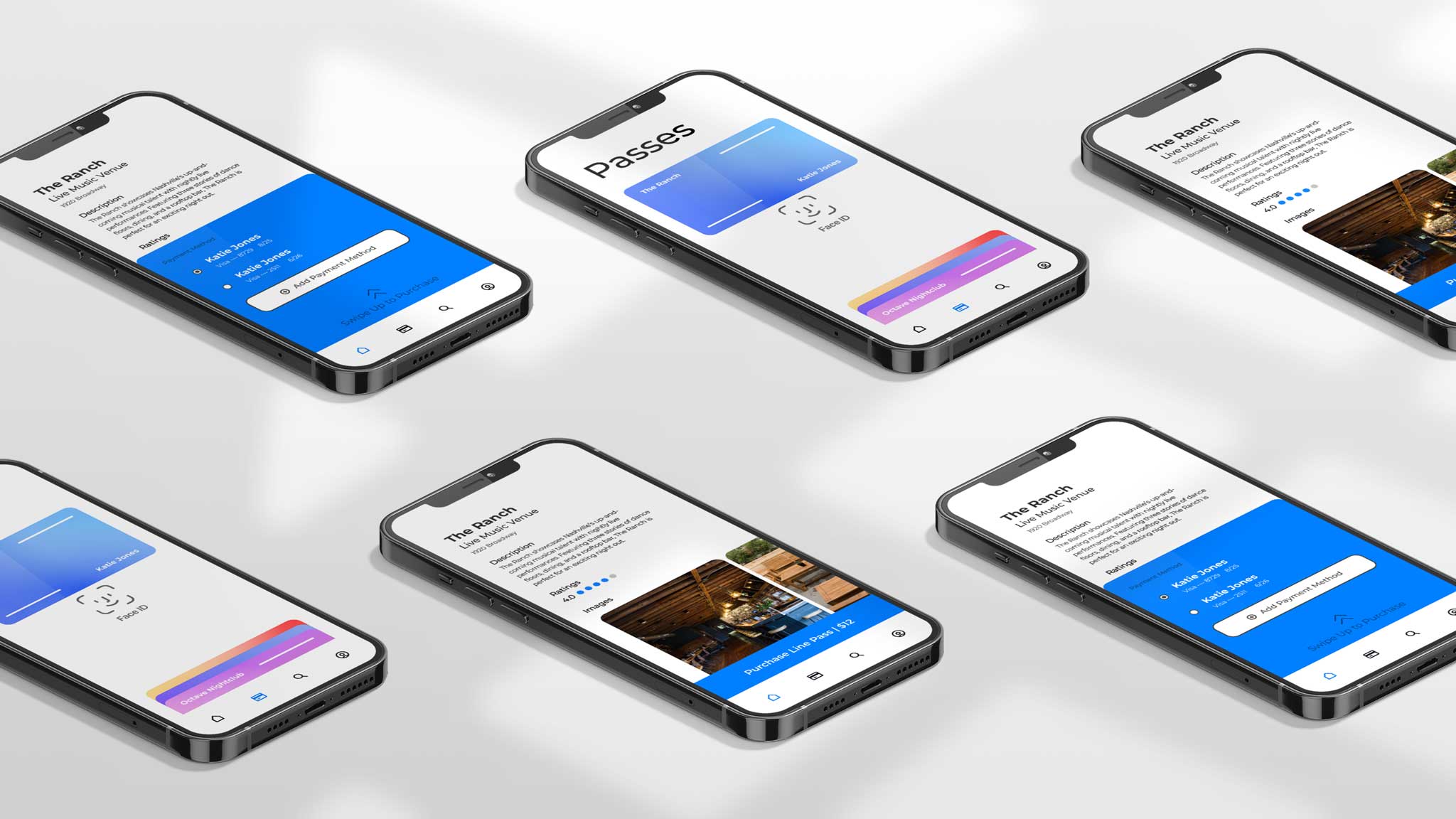
Wave Nightlife is a mobile platform that provides a line skipping service, utilized by nightlife venues in the United States.
Client
Wave Nightlife
Contribution
User Experience
Year
2022
Wave Nightlife
Mobile platform designed to provide a line skipping service for nightlife crawlers in cities within the US
Wave is a mobile platform that targeted nightlife venues such as bars, clubs, pubs, you name it, to provide their patrons with a line skipping service while also providing these venues with the power of data analytics on their best VIP customers.
As a designer, I was tasked to develop the mobile platform that a typical nightlife user would encounter when using Wave's services.
In developing the mobile platform, the UX ideas to bring into production comprised of two main challenges.
User Experience of Wave's Line Passes
Implementing a smooth experience of Wave's line skipping service that a user can navigate quickly and utilize easily when standing in line for a venue.
Creating a 'Discover' Mechanism
Creating a discover aspect within the mobile platform for users to explore and discover local venues and special events by browsing.
User Research
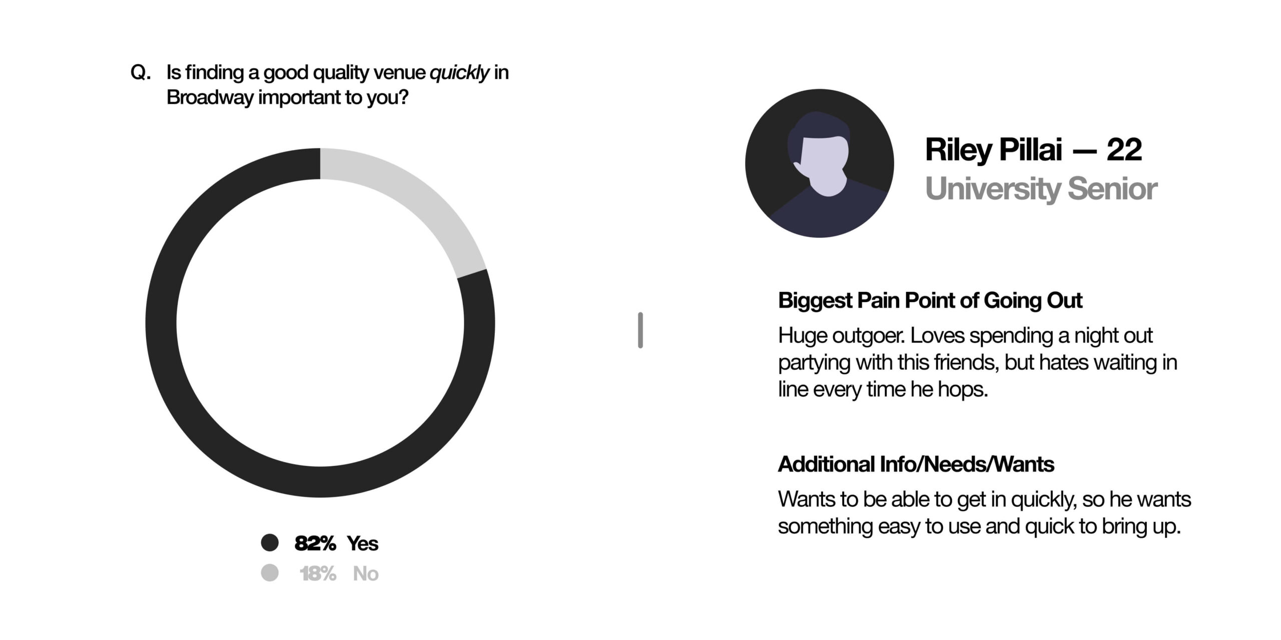
Using user surveys to find pain points to intentionally design
After familiarizing myself with the premise of Wave, I set out to find out how real people around me approached nightlife in Nashville (where I’m based). I conducted a dozen user interviews and aimed to gain an understanding of people’s typical night out in a local nightlife lens. What gets people engaged and interested?
Sample Questions:
- Have you ever used a line skipping service before?
- What factors would you consider important for a line skipping service?
- What does your typical weekend night out look like?
- How do you find places to go out in Nashville?
- What do you look for in a venue when going out?
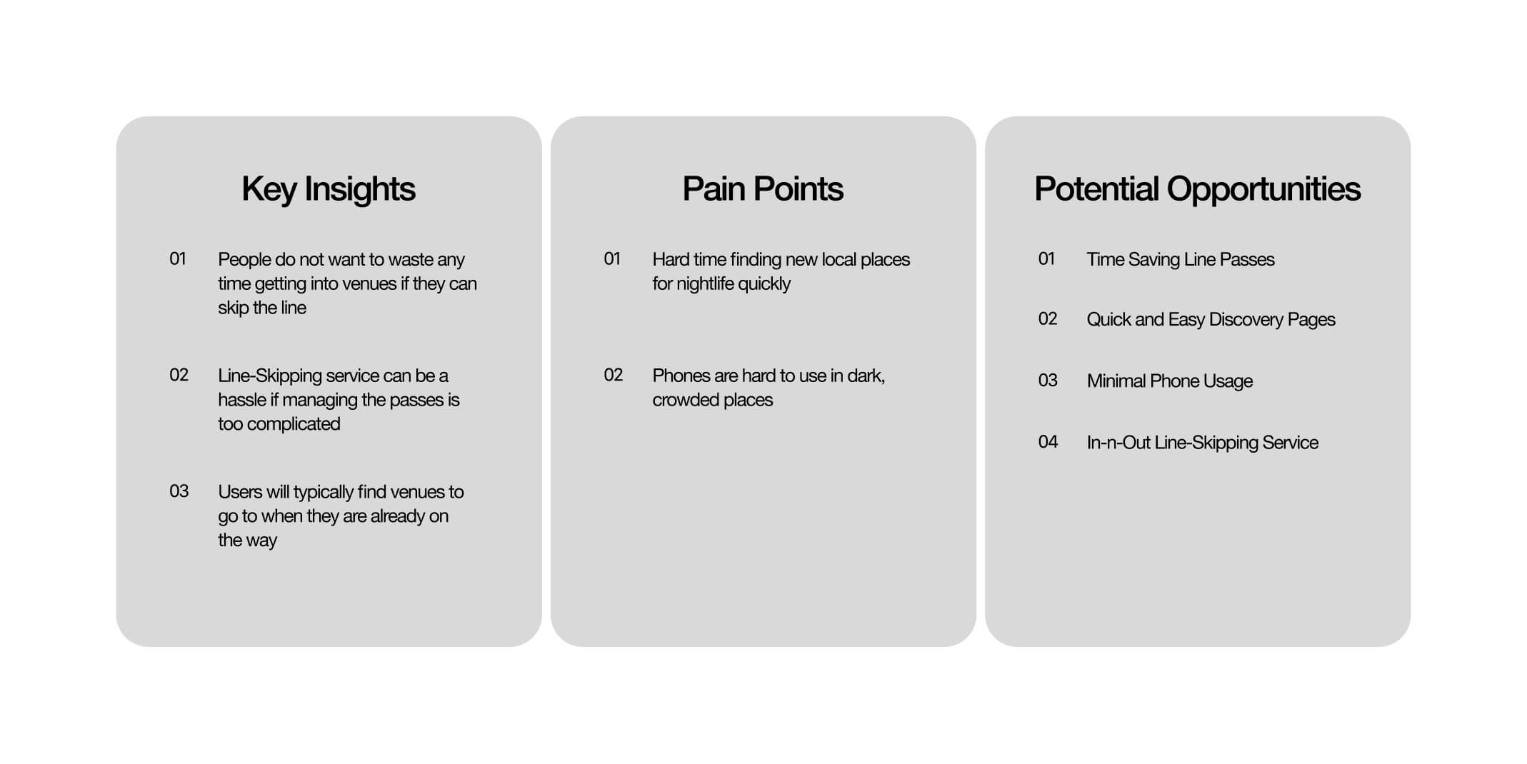
Following this procedure, I reached out to 3 individuals for a 20 minute interview. I was able to receive specific key points about certain pain points in local nightlife, specifically in finding venues and waiting in lines. The group was small, yet helped refine major pain points that come with navigating nightlife as a user.
IA Diagram
Keep it simple, stupid.
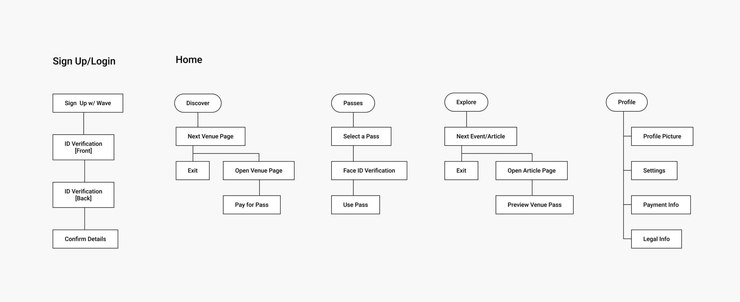
A major point that came up consistently in the interviews was that users did not want a service that they needed to spend much time on. Working with the Wave team, I structured the information architecture to envelop a very simple, yet intuitive navigation system that will allow access to both line-skip passes and exploration of local nightlife hot spots.
The first step in achieving the 'simple' navigation system is to break down the components of the most important pages (Discover and Passes). These components form the core of the mobile platform's experience.
Discover Component
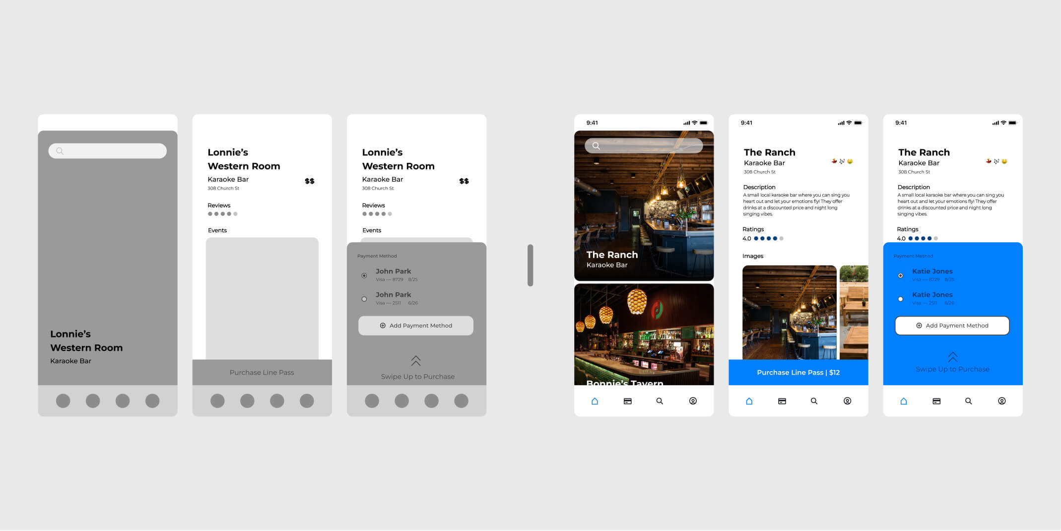
Many users have noted, within the surveys, they would most likely use Wave on the way to a venue or nightlife spot. While a user is in a mobile state, quick consumable content is incredibly effective and is an already familiar aspect within the mobile platform arena (Tiktok, Instagram Reels, Youtube Shorts, etc).
Wave's exploration navigation displays venues in a vertical carousel that quickly shows the venues name and type, and can be pressed to display auxiliary information. These explore pages lead the user to purchase 'line passes' for the displayed venue.
Passes Component
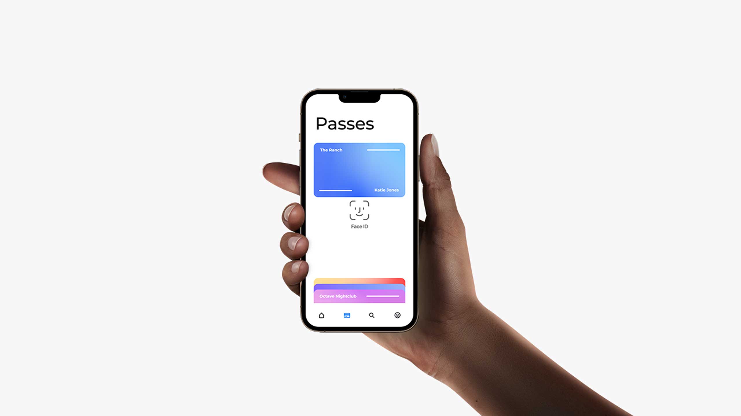
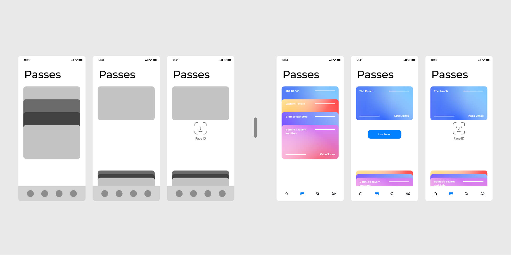
Because Wave's line-skipping service is serviced for venues that are 21+, these passes require FaceID or other biometric verification for each use for security. This is a required step, so I needed to design around this tech specification, yet still ensure easy access and quick usage. I took a note out of Apple's wallet and created 'cards' that represent the line passes.
These 'cards' are distinct from one another and can be quickly recognized through color. Each Pass is layed out accordian-style to both display the name and allow multiple passes to be viewable without scrolling for ease and quick access.
Our Solution
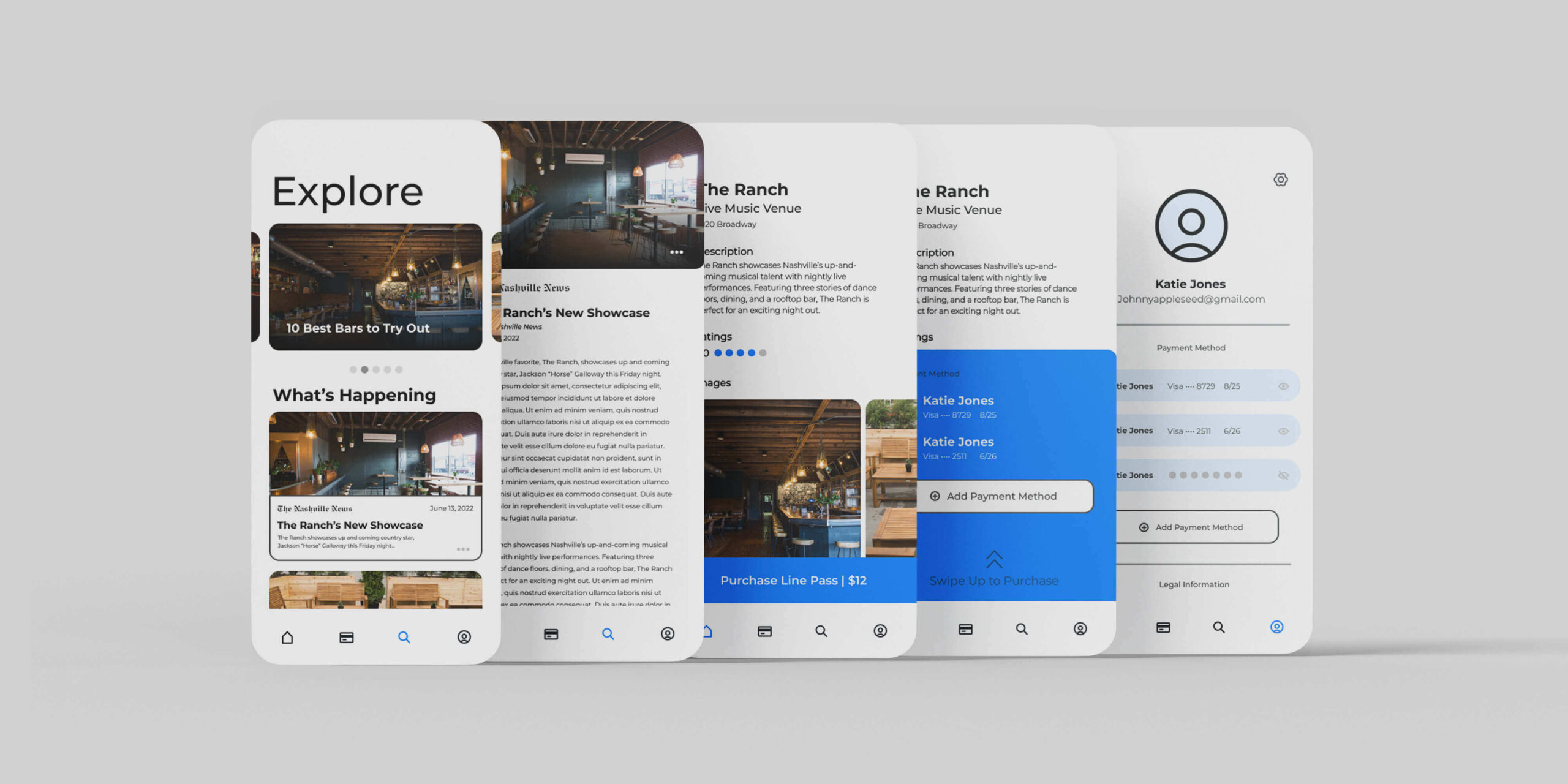
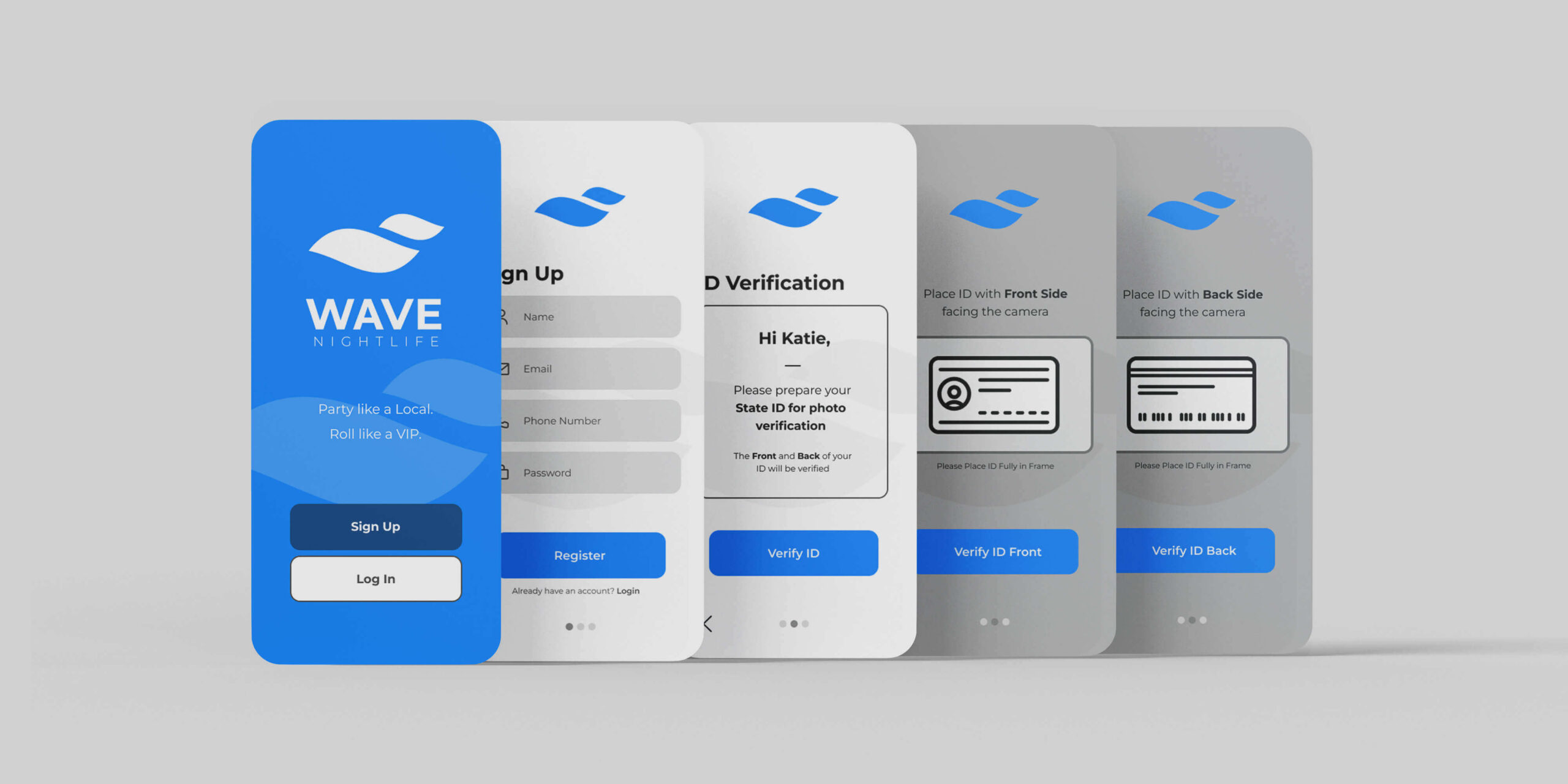
While examining the context of the challenge, I iterated Wave's mobile platform to allow for discovery of venues in a quick, comsumable fashion and utilize Wave's line-skipping service efficiently when out and about at night.
Reflection
This project was particularly interesting as there aren't market solutions that target Wave's solution to their unqiue problem, so ideating around a new concept was difficult.
01
Iterate, Iterate, Iterate. This project was by far the largest I have ever been a part of and it was quite daunting to begin. For the features that I needed to implement, I forced myself to iterate over and over again with multiple different ideas and ended up with the final product showcased here.
02
Insight driven, not process driven. My design of Wave needed to be intentional, and each feature must be backed with "Why is this the best option?". I learned heavily in this project that the features implemented all lead back to the idea of quick and efficient use and the design reflected this. Focusing on the insights, more than the process, in the future will help build my UX design.
03
User Testing. The next steps would be to user test after deployment and see what features are critical and what features can be improved upon.
